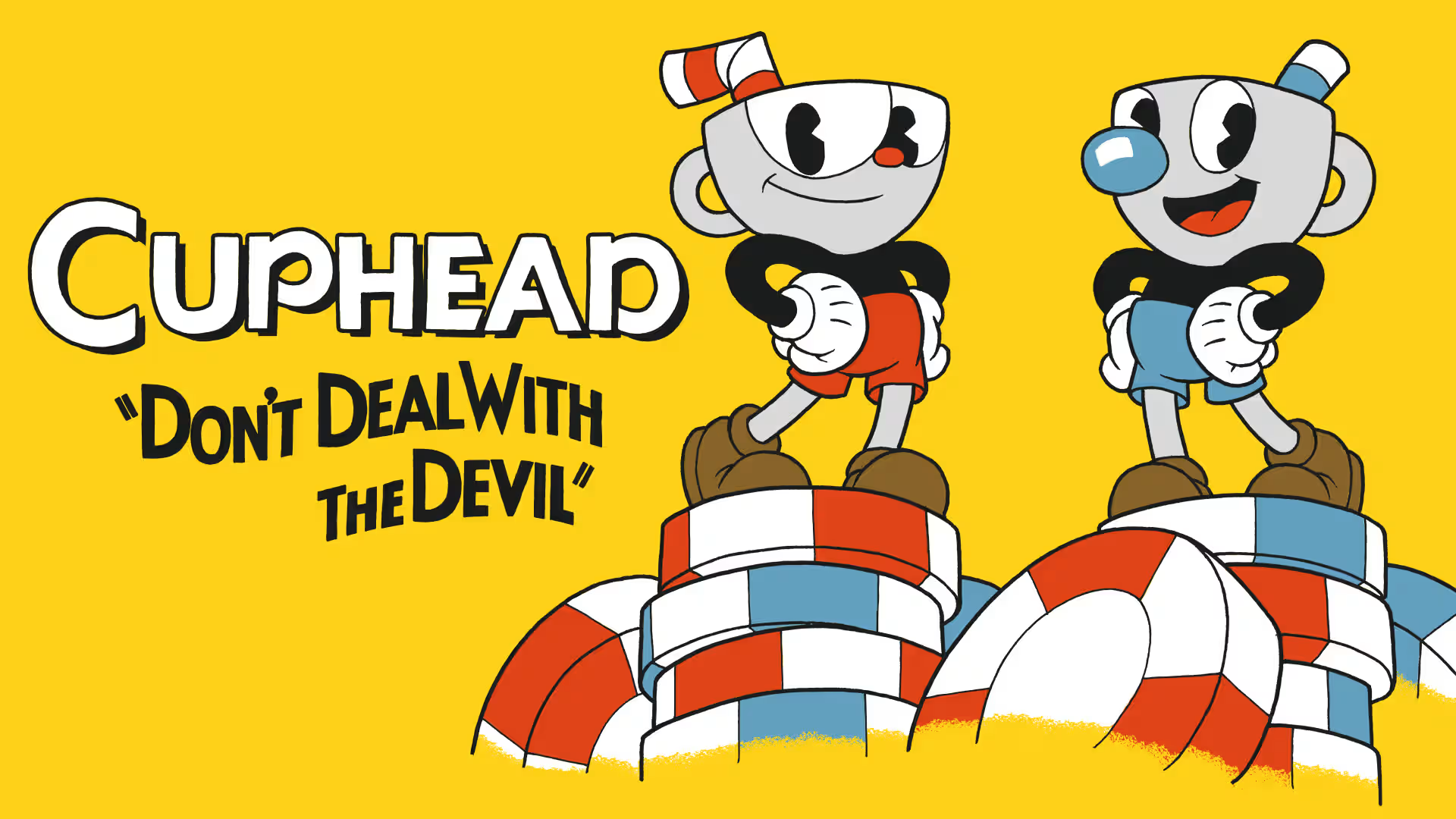
Two brothers with day jobs and everyday stress decided to make a game most studios would pass on. They skipped digital shortcuts and quick animation tricks. Every frame was drawn by hand in the 1930s Fleischer style. The process moved slowly and punished mistakes. Mortgages sat at risk. Timelines stretched for years. The goal wasn’t to ship a product. The goal was to capture an era’s spirit through art.
A small boss-rush prototype grew into something larger. Authenticity raised the bar. Each character took weeks or months. Skeletal rigs weren’t enough for the look they wanted, yet the game still had to run at 60 frames per second. Vintage style met modern responsiveness, which created a rare technical and artistic puzzle.
The road brought personal financial strain and constant iteration out of sight. There were no fairy tale moments – just redraws, reshoots, and more testing. After years of quiet polish and careful demos, Cuphead launched on major platforms. The debut didn’t come from luck. It came from stubborn choices made under pressure.
This reads as more than an indie win. It’s a founder-centered account of vision, sacrifice, and craft shaping an outcome.
From scrappy prototype to Microsoft‑backed launch
Cuphead began with one clear idea: only boss fights. The goal wasn’t style for style’s sake. It kept the project small enough to finish and kept animation costs under control. Every frame took time and care, so a narrow scope protected quality. Feedback shifted plans later. Players wanted more to do, so run-and-gun stages came in, adding variety without losing the hand-drawn heart of the game.
The Microsoft partnership changed reach and resources, not just money. Xbox placement and ID@Xbox showcases, including E3, pushed the game in front of huge crowds. In return for timed exclusivity, Studio MDHR gained help they couldn’t buy on their own. Test teams hunted bugs, certification experts guided platform requirements, and marketing support spread the word far beyond indie corners.
Unity wasn’t picked for flash. It fit the custom pipeline Cuphead needed. The team wrote tools for onion-skinning so animators could see faint prior frames and stay faithful to the 1930s style. Custom shaders added film-like grain and noise for that vintage look. None of it worked out of the box. Tools needed steady tweaking and cleanup so every frame matched the standard.
Production settled into a strict loop. Concept art set direction. Pencil tests mapped rough motion. Ink defined clean lines. Scanning moved art into the computer. Coloring brought scenes to life. Compositing stacked the pieces into final shots. Gameplay tuning then aligned mechanics with the visuals. Any late change meant redoing dozens, sometimes hundreds, of frames, which demanded patience and discipline.
Hiring followed the same measured pace. No rapid team swell, no chaos. Studio MDHR picked contract animators, composers, and engineers with care to protect quality and manage costs. The founders kept tight control of art reviews. A deliberate bottleneck, but it kept the bar high.
How art style and difficulty worked together to win players
Cuphead’s bosses look like they stepped out of a 1930s reel, but they do more than set the mood. Every enemy uses a bold outline and big, readable poses that act like signs on a busy street. Attacks and phases pop from the background, so players read patterns fast even when the screen fills with ink, sparks, and smoke. This clarity matters because the difficulty asks for quick reactions and pattern memory. Without strong telegraphs, players would hit a wall instead of learning.
The parry system turns risk into progress. Pink objects invite tight, timed jumps that fill the super meter and open the door to heavy attacks. Misses teach timing, successes feel sharp and immediate. Each attempt moves things forward and takes the edge off failure.
Checkpoints inside boss phases help retries feel fair. Phases stay short once mastered, often under a minute, so restarts don’t drag. Players jump back in with energy instead of slog. The pace creates that “one more try” pull, which plays well on streams because every run looks tense and new.
Fixed difficulty at launch made accessibility tough. The studio kept the core challenge as part of the game’s identity. Later updates added more options for different skill levels, while the main experience stayed intact.
Speedrunners and influencers leaned in. Their clips show clean routes, bold parries, and tight dodges that turn each fight into a short stage piece. The look draws people in, and the demand for mastery holds attention. Word spread through those performances, and communities picked it up fast.
Beyond day‑one sales, how DLC and licensing built a durable business
Sales didn’t spike and vanish. Excitement built early through smart platform placement and a long wishlist tail from showcases. That early interest turned into strong launch numbers, then kept rolling. Word of mouth carried it far, helped by ports to Switch and PS4 that reached players who’d waited. Bundle discounts nudged fence-sitters, turning it into an easy deal for shoppers chasing value.
The Delicious Last Course did more than add levels. It refreshed the world. Ms. Chalice brought a distinct moveset, so returning players faced new tactics instead of a repeat grind. New animation matched the meticulous style of the base game, keeping the hand-drawn feel while widening mechanics. The rollout kept the community together – one shared experience, not fractured editions.
Studio MDHR didn’t rely only on the store page. Merchandise and licensing kept the brand visible between releases. Collectibles and apparel turned fandom into daily wear, while an animated series pushed Cuphead into broader culture. Extra revenue from these efforts steadied the business alongside digital sales.
Critical acclaim mattered more than headlines suggested. Awards and strong reviews earned front-page placement on major stores, lifting visibility long after launch. Those features drove real conversions and extended the tail.
Early milestones like $4 million hint at success, but they don’t tell the whole story. The arc comes from platform reach, DLC adoption, merchandise deals, and media tie-ins working together. That mix turned a hot launch into long-term growth.
Practical lessons for indie founders from the Moldenhauer brothers
Cuphead’s journey isn’t a tale about nostalgia alone or a checklist of hard bosses. It’s a clear example of sticking to what matters when pressure rises and choices get messy. The Moldenhauer brothers ignored fads and aimed for a true 1930s art style. It cost time, money, and energy, but it gave the game heart. Commitment like this shaped every call, from cutting scope to protect quality to picking partners who expanded reach without taking creative control.
Indie founders can pull lessons that go past visuals or genre. Success rests on defining core pillars, the pieces that never move, and deciding where to bend when timelines slip or budgets shrink. Plan for worst cases with cash flow so surprises hit like bumps, not cliffs. Treat marketing as part of development and build it in early so momentum grows before launch day chaos.
Partnerships matter, and they demand clear tradeoff math. What does exclusivity cost? What real visibility shows up? Do support teams reduce certification risk? Smart answers here lead to deals that extend a project’s life instead of fencing it in.
Here are some practical steps drawn from the Moldenhauer brothers’ development story:
- Define a non‑negotiable creative pillar, like fully hand‑drawn animation. Write where compromise lives, such as scope cuts or fewer levels. Review monthly so silent creep doesn’t slide in.
- Model cash runway with a pessimistic lens. Include slowdowns from custom pipelines, rework cycles tied to handcrafted art, and buffers for platform certification delays.
- Map partnership asks with precision: funding gaps, platform exposure targets, QA and certification support, launch timing. Then weigh timed exclusivity in dollars and discoverability.
- Prototype marketing next to gameplay early. A trailer‑ready vertical slice fuels wishlists at showcases long before release. Track lift from each event and tune content plans.
- Design mechanics that read well on camera. Tight boss phases and clear telegraphs boost streamability. Test short, no‑commentary clips to confirm instant appeal.
Before final production or publisher talks, indie creators should audit projects with these points. Identify what defines the vision and plan around it with care while building steady buzz. This shifts risky bets into calculated moves and keeps dreams alive long enough to become wins.

Leave a Reply