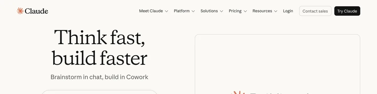
If an AI-generated site feels hollow, it’s not the tool’s fault. It’s the prep work you skip. Claude can write like a person and Framer can make it look sharp, but neither can rescue a bad brief. This workflow for building a website with Claude and Framer is thorough and honest, and it relies on your judgment at every step.
Before you write a single prompt, give Claude three things:
Tell Claude what you do, who you serve, and the problem you solve. Be specific about the work, not just the category.
Describe your ideal customer. Demographics, pain points, goals. The more concrete you are, the more the copy will sound like it was written for them.
Outline your core offer. The product or service, what sets it apart, and pricing if that’s part of how you talk about it.
Skipping this step is how you get generic copy. Claude defaults to broad, buzzword-filled language when it has no constraints. Give it a vague prompt and you’ll get vague output. For example, “A web design agency that helps small businesses” tells Claude nothing. “A one-person web design studio that builds sites for solo lawyers in under two weeks, avoiding agency runaround” gives it a real brief. The second version names the audience, the timeline, the pain point, and the tone. The first one leaves the model to guess, and it will guess in the most generic direction possible.
After 20 years in tech, I’ve learned that AI tools are only as good as the prompt. Claude needs guardrails to produce human-sounding content, and those guardrails are your business details, your audience, and your offer. Feed it nothing, and it invents a personality for you. Feed it well, and it mirrors yours.
One caution: don’t overload Claude with every instruction at once. A wall of requirements produces muddled output. Work in layers. First, get alignment on brand voice, then tackle copy. Each pass gets more specific, and Claude stays coherent because it’s only handling a few variables at a time.
This upfront work saves hours of rewriting later. It’s not a magic bullet, though. You’ll still edit by hand, and that’s by design. The goal isn’t copy you publish untouched; it’s copy close enough that your edits make it genuinely yours.
On this page
Mapping Out Your Sitemap and Page Structure
With the groundwork done, the next move is deciding what pages you actually need. This is where a solopreneur website workflow either stays lean or quietly balloons into something unmanageable. A clear sitemap, agreed on before you open Framer, saves you from rebuilding navigation, restructuring CMS collections, and redoing URLs later.
Here’s the process I’d walk through:
Ask Claude for a sitemap based on your business type. Tell it whether you’re service-based, a SaaS product, or ecommerce, and let it propose the structure. For a solo consultant, that might include Home, About, Services, Case Studies, and Contact. That set covers trust, proof, and a path to conversion without scattering attention.
Push for a logical URL structure with parent and child pages. SEO lives and dies on clean URLs, so ask Claude to output an information architecture that shows hierarchy, not just a flat list. For a consultant, that could mean /services/ as a parent with /services/strategy, /services/implementation, and /services/audit as children. Claude is good at this and will map out a hierarchy that makes sense to both search engines and visitors. Translating to Framer is straightforward: the CMS lets you define these pages and their hierarchy directly, so each parent and child becomes a CMS collection entry. Get this right on paper first, and the setup is mostly data entry.
Be ready to cut Claude down. Claude loves to overcomplicate. I’ve seen it suggest fifteen pages for a three-person company, and I always cut that down hard. For a solopreneur site, five to seven core pages is the ceiling. More than that and navigation bloat sets in: visitors get choice paralysis, the site gets harder to maintain, and every extra page is another one to keep updated. If Claude suggests a blog, a resources hub, a testimonials page, a FAQ, and a press page for a solo operator, push back. Keep what serves the sale and cut the rest.
Draft a page purpose one-liner for each page. Ask Claude to write one sentence describing what each page is for. The Services page exists to explain what you do and why it’s worth paying for. The About page builds trust through your story and credentials. The Case Studies page proves results. These one-liners become your reference point when you write copy later. If a sentence doesn’t serve the stated purpose of its page, it doesn’t belong there.
Lock it in before you build. Framer’s page management is visual, which is great for iteration but terrible for improvisation. If you start building without a settled sitemap, you’ll find yourself moving whole sections, reconnecting navigation, and reworking layouts that were built on assumptions you’ve since changed. A clear sitemap agreed on before you open Framer prevents exactly that kind of rework.
Writing Copy That Actually Sounds Human

Now you’re at the part that determines whether the site works: the copy. This is where AI copy for websites either lands or falls flat, and the difference comes down to how you frame the request.
Here’s the prompt template I use every time:
Write for a busy founder who hates jargon. Use short sentences, concrete examples, and no buzzwords. You are writing the homepage for a one-person web design studio that builds sites for solo lawyers in under two weeks. The reader is a solo lawyer who’s been burned by agency runaround. Speak directly to them.
That template does three things. It tells Claude who the reader is, how long the sentences should be, and what language is off-limits. Give it all three and the output comes back with a voice. Give it none and you get marketing-speak that could belong to any company on the internet.
The buzzword ban matters more than you’d think. Claude has a default vocabulary it reaches for when not told otherwise, and it’s the same vocabulary that makes every AI site look identical. I always ban words like “leverage,” “streamline,” “cutting-edge,” “game-changer,” “empower,” “seamless,” “robust,” “innovative,” “world-class,” and “solutions” from the prompt. Without that ban, Claude sprinkles them in on its own. It’s not lazy; it’s statistical patterns trained on a mountain of corporate fluff. You have to explicitly tell it to avoid the words that make sites feel generated.
Here’s what that looks like in practice. Without constraints, Claude produces something like this:
Our cutting-edge web design solutions empower solo law firms to streamline their digital presence. We leverage innovative strategies and robust technology to deliver seamless, world-class websites that drive results and elevate your practice.
Every word there is a red flag. “Cutting-edge” and “empower” and “leverage” do zero work. The sentence says nothing about what you actually do or who you serve.
Now the same page with the prompt template above:
You’re a solo lawyer. You don’t have time to chase a web designer who doesn’t return calls. I build your site in under two weeks, and I don’t disappear after launch. You’ll have a website that makes clients trust you before they even pick up the phone.
Same business, completely different feel. The second version has a subject, a timeline, and a promise. It reads like a person wrote it because the prompt forced Claude to sound like one.
A few practical rules keep the workflow tight. Write one page at a time, not the whole site in one go. Feed Claude the page’s purpose from the sitemap you locked in earlier, and it stays focused on that single job. The homepage doesn’t need to explain your entire process; that’s what the Services page is for.
Be ready to cut length, too. Claude runs long by default, and verbose copy dilutes the message. Set a word limit in your prompt or simply tell it to “be concise,” then trim anything that survives that still doesn’t earn its place.
Even with a strong prompt, you’re not done. I always fact-check every claim and add a real client story or a specific number before I call it done. Claude can invent testimonials and fabricate results if you let it, so verify anything that sounds like a fact, and drop in a personal anecdote where it fits. That’s the layer no prompt can generate for you, and it’s the difference between copy that sounds like a brand and copy that sounds like a person. The AI gets you 80 percent of the way; the last 20 percent has to be yours.
How to Build a Website with Claude and Framer, No Agency Needed
This is where Framer earns its keep. It handles the build mechanics while you stay in control of the decisions that actually matter. The workflow is deliberate: Claude produces the copy, Framer assembles the structure, and you make the calls on everything that determines whether the final site feels human or assembled. Here’s how the whole thing comes together, step by step.
Set up a Framer project from scratch. Start with a blank canvas. Framer offers premade templates, and they’re tempting because they look polished out of the box, but that’s exactly the problem. A template site is instantly recognizable as a template site, putting you right back in the AI-generated trap. If you want a unique look, a blank project is the only honest starting point. You’ll spend a little more time placing elements, but you’ll end up with something nobody else has.
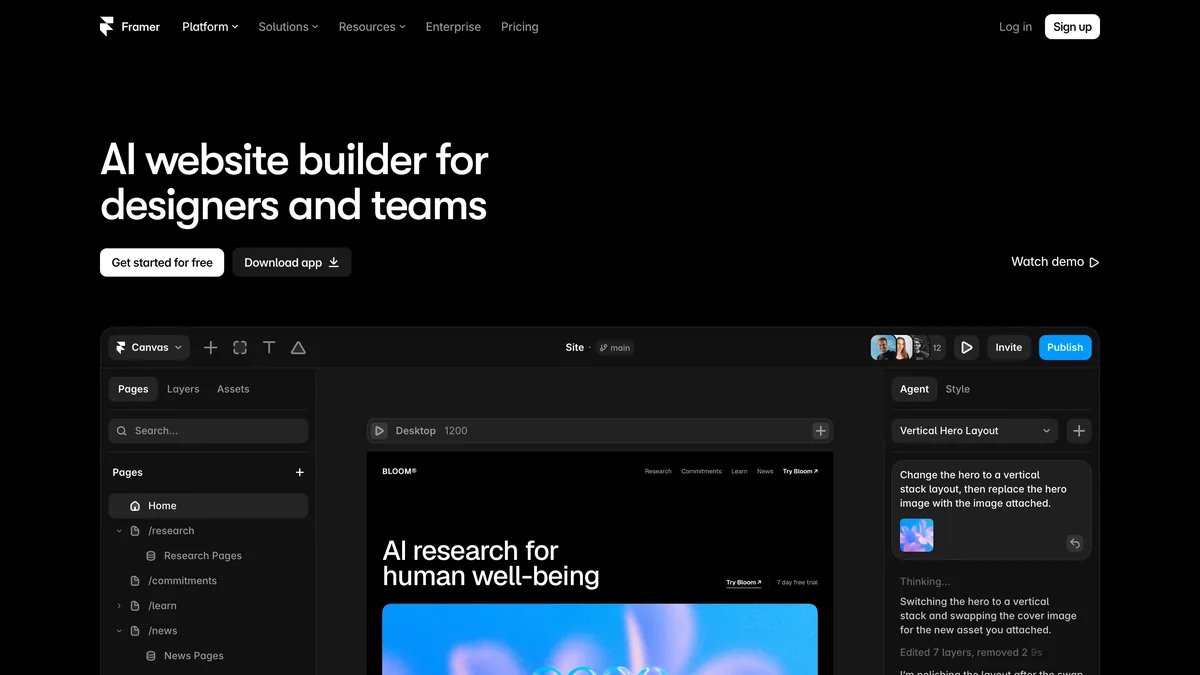
Use Framer’s AI agent to generate a layout based on your sitemap. Feed the sitemap you locked in earlier into Framer’s AI agent and let it propose a layout. It will draft section order, placeholder text, and a visual hierarchy that roughly matches your page structure. Treat this as scaffolding, not a finished design. The agent is useful for getting a skeleton on screen fast, but its taste is average by definition, and average is what you’re trying to avoid.
Import Claude’s copy. Copy-paste each page’s text from Claude into the appropriate components. The homepage copy goes into the hero, the intro blocks, the sections you generated in step two. The Services page text goes into its own components. Take it page by page so nothing gets mixed up. Then link the pages in the navigation. Framer’s navigation component lets you point each menu item at a page in your project, and once the links are set, the whole site starts to feel like a coherent thing rather than a collection of loose sections.
Know where Framer’s AI agent falls short. The AI agent has real limits, and it’s worth naming them. It can produce mismatched styling where one section feels like it belongs to a different site than the one next to it. It will occasionally throw in inconsistent fonts, mixing a bold display face with a body font that clashes with it, and it sometimes arranges sections in an order that makes sense to a machine but not to a visitor trying to understand what you do. None of this is fatal. It’s a starting point, and starting points are supposed to be adjusted. Plan to spend real time going through the generated layout section by section, fixing what doesn’t hold together.
Customize the design by hand. This is where human taste earns its keep. Framer’s built-in typography scale gives you a consistent set of type sizes and weights to work from, so you’re not eyeballing font sizes and hoping they relate to each other. The color picker lets you dial in a palette that matches your brand rather than whatever the AI happened to choose, and the breakpoint controls handle responsive design, letting you adjust how each section looks on desktop, tablet, and mobile.
I always tell people to skip the AI’s first color choice. It tends to reach for the same safe gradients and muted blues that every AI-generated site uses. Pick your own palette from your brand or your logo, and the site immediately stops looking like a template. The same goes for spacing. No AI can tell you that a hero section needs 40 more pixels of breathing room, or that the gap between a headline and its subheading should be tighter. That judgment is yours, and it’s the difference between a site that looks assembled and one that looks designed. The hero image especially is a human decision. Choose something that reflects your actual work or your actual face, not a stock photo that could belong to any business.
Framer’s plans, honestly assessed:
The free plan covers a simple launch site. You get Framer’s core building tools and hosting on a Framer subdomain. It’s fine if you just need to get something live.
The paid plan (from $5/month) is needed for a custom domain and more pages. If you want your own URL, this is the minimum you’ll pay. For most solo founders, this is the right tier.
The team plan ($25/month) adds CMS functionality, which is genuinely useful for blogs or portfolio collections, but for a solo site with a handful of pages, it’s overkill. You’re paying for features you won’t touch.
A Framer build without agency involvement is very doable at the paid tier. The free plan gets you a working site, but the custom domain alone justifies the $5 a month. Skip the team plan unless you’re actively running a content operation that needs a CMS.
The key is to remember what Framer is good at and what it isn’t. It’s excellent at turning a structure and copy into a live, responsive site without writing code. It is not good at making taste decisions. The AI agent will get you 60 percent of the way, and your manual adjustments are the other 40 percent. That split is exactly what you want, because the part the AI can’t do is the part that makes the site feel like it was made by a person.
The By-Hand Polish Pass: What AI Can’t Fix for You
Up to now, the focus was on making Claude and Framer do the work. But this is where your judgment takes over. No AI can look at a finished page and tell you it feels off. No model can feel the awkward pause in a headline or notice that a section reads like it was assembled from parts. That’s your job, and it’s the difference between a site that looks like it was made with AI and one that doesn’t.
Here’s the checklist I run through on every build. It’s not glamorous, but it’s what separates a finished site from a draft that got published.
Scan for AI clichés that slipped through. Even with a tight prompt, Claude will occasionally sneak something past you. I once found a 3,000-word paragraph hidden inside a testimonial section, the kind of run-on wall of corporate-speak that no real client would ever write. I cut it to one line. Look for repetitive sentence structure across sections, generic placeholder imagery that could belong to any business, and any phrase that made you pause and think, “Would a person actually say this?” If the answer is no, it goes.
Confirm every sentence earns its place. Read each page out loud, top to bottom. If a sentence doesn’t advance the page’s stated purpose from your sitemap, delete it. If a headline is vague enough to apply to any company in your industry, rewrite it until it names what you do and who you do it for. The headline and subtext carry the most weight, so give them the most attention. Your unique value should be visible in the first five seconds, not buried on the third scroll.
Add personality by hand. This is the layer Claude cannot generate for you. Insert a real story about a client, a personal photo, or a specific result you’ve delivered. It doesn’t have to be dramatic. A sentence like “I rebuilt a family law practice’s site in 11 days and their consultation requests doubled” does more for trust than any AI-generated testimonial ever will. This turns a template into a site people believe.
Open every page on a phone. Claude can’t do this, and neither can Framer’s preview pane. Pull out your actual phone, load each page, and scroll through it. Check for horizontal overflow where an element spills past the screen edge, text that’s too small to read without zooming, and tap targets that are frustratingly close together. These are the details that make a mobile visitor bounce, and they only show up on a real device.
Check load time. Framer’s performance is decent out of the box, but bloat creeps in. Remove heavy animations that don’t serve a purpose, delete unused fonts from the project, and trim any oversized images. Framer’s built-in analytics will show you your actual speed scores, so there’s no guessing. If a page takes more than a couple of seconds to load on mobile, something needs to go.
Review your call to action. Your CTA button should be clear, above the fold, and impossible to misunderstand. “Get a Quote” beats “Learn More” every time, and test the contact form. Actually fill it out, submit it, and confirm the message arrives in your inbox. I’ve seen too many sites go live with a form that silently eats every submission. That’s not a technical failure; it’s a business failure wearing a technical disguise.
Run through this list twice if you have to. The first pass catches the obvious problems, and the second one catches the ones you were too close to see the first time. This is what how to create a website using Claude actually looks like in practice: the AI does the drafting, and you do the editing that makes it yours.
Your Launch Checklist: Making Sure Everything Actually Works
You’ve written the copy, built the pages, and polished everything by hand. Now comes the part that separates a real site from a demo: verifying that every piece actually works before you hit publish. A broken form or a dead link is the fastest way to undo all the trust you just built. Here’s the checklist I run through before any site goes live.
Point your domain to Framer’s servers. If you bought a custom domain, update its DNS records to point at Framer. The exact steps depend on your registrar, but Framer provides clear guides for the common ones. After you’ve made the change, verify SSL is active. A browser warning about an insecure connection will send visitors running before they read a single word.
Set your SEO basics. Open Framer’s SEO panel on each page and set a meta title and description. Claude can generate initial versions of these, but refine them by hand. The AI will write something technically correct and completely flat. Rewrite the title so it names what the page does and the description so it makes someone want to click. Then submit your sitemap to Google Search Console so the search engine actually finds your pages.
Test every form and integration. Fill out your contact form and confirm the message arrives. Do the same for any email signup and any third-party tools you’ve connected, whether that’s Mailchimp or Calendly. Nothing kills credibility like a broken button. I’ve watched sites launch with a contact form that silently swallowed every submission, and the owner only found out weeks later when a client mentioned they’d emailed twice with no reply.
Open the site on every browser you can find. Chrome, Safari, Firefox, and at least one mobile device. Framer’s rendering is consistent across most browsers, but the occasional CSS quirk does slip through. Scroll every page, click every link, and check that nothing overflows or clips on a phone screen.
Have someone else read your copy aloud. Not you. Someone who hasn’t been staring at these pages for days. If they stumble over a sentence, rewrite it. If they pause at a headline, tighten it. This is the last chance to catch the awkwardness you’ve gone blind to, and it’s the difference between launching a site that feels like you and launching one that feels like a robot.
The whole workflow comes down to a simple division of labor. Claude handles the copy and structure, Framer handles the design and hosting, and together they form a capable AI website builder for solopreneurs, but neither tool has taste, and neither can tell you when something feels off. That’s the human in the middle, the one who feeds Claude the right brief, overrides Framer’s default choices, and reads every line out loud before anyone else ever sees it. That person is what makes the site feel like it was made by a person, because it was.

Leave a Reply