
Hunting for Framer wedding templates that don’t feel slow or hard to tweak? Here’s a straightforward, founder-style take on five strong picks judged on style, speed, and ease. Amora ranks first, Rajal lands in second, Capture comes third – and it’s free. Minimalistique takes fourth, and Wedora closes the list in fifth. Rankings reflect visual polish, how simple each one is to customize, mobile experience, performance, and the type of user each suits.
Each template earned a score out of five across those areas. Mobile experience and speed mattered most since most guests browse on their phones. Tests ran on the latest Framer build with the same content in place: hero images, a schedule, RSVP forms, and gallery sections. Couples planning a single site, planners who run several events, photographers with portfolio needs, and designers scouting patterns all get a shortcut here.
Some links are affiliate links, which may pay a small commission if a purchase happens. Editorial decisions came first, not commissions or partnerships.
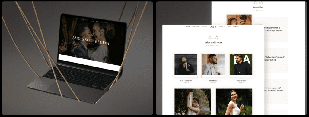
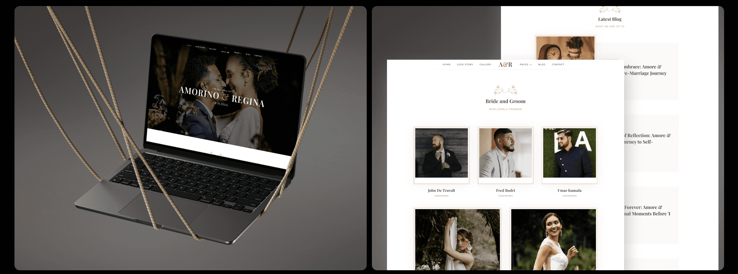
Amora is the best all-around pick for a premium wedding website
Amora blends romance with a modern touch, giving wedding websites a look that feels timeless and fresh. Typography pairs an elegant serif for headlines with a clean sans-serif for body text. The mix feels calm and distinctive. Soft neutral colors add warmth without visual noise. Optional accents bring small hits of color, and wide spacing lets big photos take center stage.
Customization stays simple for people who want control without hassle. Global color and type tokens live in Framer Styles, so changing the site’s mood takes a few clicks. Prebuilt sections cover key needs: personal story areas, a clear schedule, wedding party intros, embedded registry links, an FAQ with common answers, and RSVP forms that connect right away. The hero section works with drag and drop, so swapping an image or video at the top is fast.
Mobile gets first-class treatment. A sticky bottom nav keeps Schedule, RSVP, and Map one tap away as users scroll. Buttons stay large enough for easy taps. Galleries use lazy loading and responsive cropping, so faces stay framed even on small screens.
Performance stays strong. After basic image optimization and light code tweaks, Lighthouse scores on mobile sit around 90-95. Animations use CSS transforms for smooth 60 fps motion on mid-range phones. Scrolling through photos feels fluid.
Amora suits couples who want an upscale feel that’s still friendly. It also helps wedding planners run multiple events with consistent branding across welcome drinks, ceremonies, and brunches. Embedded registries keep everything in one place, so guests find details fast.
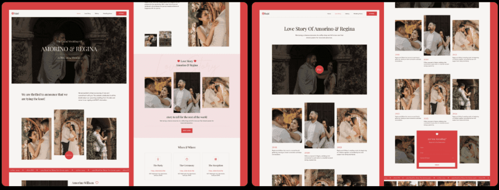
Rajal delivers an elegant editorial look for photo-first stories
https://www.framer.com/marketplace/templates/rajal/Rajal brings an editorial magazine vibe that feels polished and inviting, ideal for weddings where photos carry the story. Big headlines, clear hierarchy, and oversized pull quotes guide the eye to full-bleed images. Engagement shots and portfolio highlights jump off the page, with clean space around each photo to keep the layout calm.
Customization feels thoughtful, with section variants built for lookbooks, vendor credits, and timelines. Serif or all-sans swaps keep the structure intact, so the mood shifts from classic to modern without breaking the layout. Light and dark modes add style options that suit different themes and personal tastes.
On phones, it avoids scroll-jacking and leans on native momentum scrolling that feels right under a thumb. Image grids fold into vertical stacks with smart spacing, so photos stay sharp on small screens. Previous and next controls sit within easy reach, sized for quick taps.
Performance stays strong. Image compression pairs with WebP to keep pages fast, even with high-res visuals. Font loading uses a swap method to avoid invisible text flashes. Mobile Lighthouse scores usually land in the 88 – 93 range, depending on image weight.
This template shines as a Framer wedding template for photographers who want the work front and center while offering clients sleek sites as an add-on. It also fits destination weddings where each frame sells the place and the day, letting visuals do the heavy lifting.
Capture is the fastest free option for a simple couple site
Capture keeps the focus where it matters – the couple and the day. The layout is minimal on purpose. One bold hero image, clear date and location blocks, no flashy effects getting in the way. Visitors land, see what they need, and feel at ease.
Setup moves fast because the template keeps choices tight and the page short. About, schedule, RSVP, and gallery cover the essentials. Most couples launch in under an hour with no endless tweaking. Planners who need extra events duplicate sections and move on.
On phones, it feels natural. A single column scrolls smoothly, and large tap targets make RSVP links and maps easy to hit, even with clumsy thumbs. Forms from Tally or Typeform drop in cleanly. Text stays readable at 16 – 18 pixels, so guests don’t pinch and zoom.
Speed is the point. Small assets and lean code help pages fly. Size images before upload and Lighthouse scores on mobile often land between 95 and 99, which is rare for a free template. Couples get a fast site that works well right away, with no hours spent fiddling in the backend.
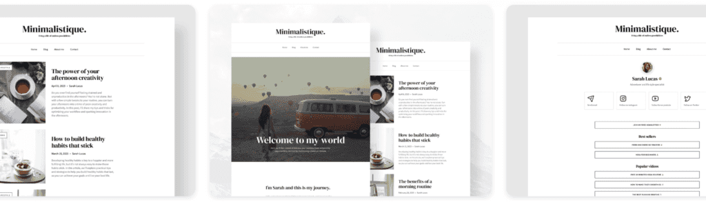
Minimalistique offers refined minimal design for tasteful brands
Minimalistique uses an airy grid that makes every page feel calm and elegant. Micro-interactions add small, thoughtful moments that bring the site to life without calling attention to themselves. Typography sets the pace, guiding visitors through each section in a way that works beautifully with soft, natural portraits. The palette stays quiet, so images and words carry the message.
Customization feels like tuning an instrument. Token-based spacing and type scales keep layouts balanced with little effort. Couples pick from alternate cover layouts: a split image with text for contrast, a full-image cover for instant impact, or a text-only option for a crisp, minimal start. RSVP modals appear when needed and get out of the way. Registry buttons sit where guests can find them, without clutter.
On phones, readability comes first. Line length stays between 45 and 75 characters per line, which reduces eye strain during long scrolls. Collapsible sections store details like dress code or parking until guests want them, so pages stay tidy while essentials remain close. Quick-jump anchors near the top let visitors skip to key sections fast.
Performance respects user settings. Motion eases off when reduced motion is enabled, which helps anyone sensitive to animation. Locked image aspect ratios stop layout shifts as photos load, so the site feels steady from start to finish. Mobile Lighthouse scores usually land between 90 and 94, showing strong speed and visual stability.
Minimalistique suits couples who prefer tasteful restraint over flash. It’s also a smart pick for wedding planners with multiple events and light content needs – a minimal Framer wedding website template that balances style with low upkeep.
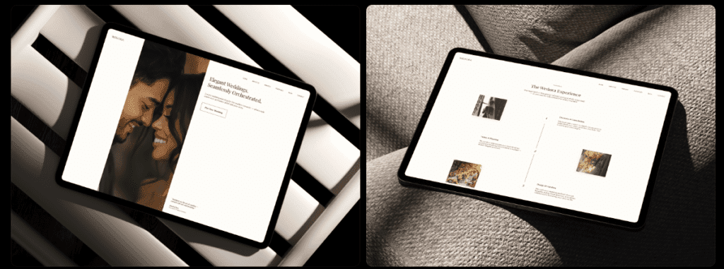
Wedora adds playful personality for bold, themed weddings
Wedora has real personality, made for couples who want a lively, distinctive wedding site. Color accents pop on clean backgrounds. Decorative dividers add a handmade feel between sections. Optional illustrated motifs bring playful vibes – garden blooms, coastal waves, retro patterns – and help the site tell a story beyond words and photos. It leans into bold themes where every detail gets room to shine.
Customization goes deep, with more controls than most Framer wedding templates. Couples pick section variants like countdown timers to build excitement, story timelines that unfold memories, or guest info blocks loaded with practical details. There’s plenty to tweak, but keeping styles aligned across pages takes patience and a sharp eye to maintain cohesion and avoid visual noise.
On phones, Wedora treats flair with care. Parallax and layered effects don’t just cut off. They fade out when users enable reduced motion or when performance needs it. Call-to-action buttons stretch full width at the bottom of the screen for easy taps, which helps guests who are moving fast.
Performance improves when animations are dialed back on mobile. Turning off non-essential effects keeps Lighthouse scores above 85 even with all the fun flourishes. Compressing illustrated assets like SVGs and PNGs preserves speed without losing visual charm.
Best for creative couples seeking a one-of-a-kind vibe, and for designers comfortable fine-tuning every detail. Wedora pays off when time is spent polishing its rich features into a smooth experience without visual overload.
How to choose a Framer template and launch your site smoothly
Pick a Framer wedding template that fits the couple’s story and style preferences. Amora suits multi-event weekends and gives a polished, upscale feel. Rajal works for photo-led sites with an editorial look. Capture is free and fast, ideal for a quick launch. Minimalistique favors calm minimalism with refined details. Wedora suits bold personality and playful themes.
Weigh content volume and setup time. Lots of photos or mostly text? Hours to tweak, or a short window? Multi-event planners land on Amora or Minimalistique. Photographers lean toward Rajal. Tight timelines point to Capture. Creative couples who want deeper customization tend to choose Wedora.
Here’s a quick launch checklist:
- Duplicate the template to experiment safely.
- Swap placeholders with real names, dates, and schedules.
- Compress images to about 1600px wide to reduce load times.
- Add RSVP forms with Tally, Typeform, or Framer Forms.
- Test on three different phones plus one older device to spot quirks.
For performance, turn on image lazy loading so pages load as guests scroll. Use font-display: swap to avoid invisible text while fonts load. Lean on Framer’s responsive images to keep mobile Lighthouse scores in the 90s.
Set global tokens before editing sections. Define colors, type styles, and button designs first. Consistent choices here prevent mismatched looks across pages.
If these tips helped and a template is purchased through the links, the support funds ongoing research here, with no impact on rankings or recommendations.
Leave a Reply