
A portfolio isn’t a gallery. It’s a sales tool. From a founder’s view, every pixel and paragraph should push one goal: turn visitors into clients. Clarity beats clutter. Stories beat static images. Speed beats spectacle. When picking Framer portfolio templates, message clarity mattered more than flashy effects.
Each template was tested with the same sample content – six projects plus headline and service pages – to see how fast it shipped and how smooth customization felt. Load speed and layout stability were measured in preview and live on desktop and mobile under throttled conditions. The testing didn’t stop at numbers. The ranking leaned on conversion checks too: do people grasp what you do in a second, are case studies easy to scan, and how many clicks to reach out?
This process filters out hype and favors real-world outcomes. Affiliate links will be labeled so readers know the score. The spotlight stays on what moves results: fast pages, clear message hierarchy, and client-proof stories that invite action.
Viral is the fastest way to ship a clear, high‑converting portfolio
Viral helps solo designers and developers get a polished portfolio online fast, without losing clarity or conversion. Every visitor should know what’s offered in seconds and feel welcome to reach out. With content ready, setup takes about an hour.
The hero section opens with a bold, single-line value proposition. No fluff. Just what’s done best. Social proof sits right below – client logos or short testimonials – to build trust early. Case studies stick to a simple pattern: problem, approach, outcome. The structure keeps the story tight and scannable.
Speed stands out on mobile. Pages feel quick, which matters when prospects browse on the go. The largest section loads in roughly 1.6 seconds, and layout shift sits near zero at 0.01. The homepage stays under 1.2 MB, so images appear fast thanks to upfront optimization. No heavy animations by default. Smooth over flashy.
Customization stays light. A global styles panel controls font sizes, colors, and grid widths in one spot. It’s easy to toggle sections like testimonials or call-to-action blocks based on how much info should show. Swap hero media without breaking the layout. The structure holds.
Best for solo operators who need leads quickly and want a clean, professional portfolio from day one.
Portfolite puts storytelling first with rich, scannable case studies
Portfolite focuses on storytelling. Creatives show full projects with long-form case studies that cover challenges, constraints, process snapshots, and measurable outcomes that prove impact. It adds a sticky outline with built-in anchors so visitors can scan and jump to any section with ease.
It supports mixed media like video loops and before/after sliders, with no custom code needed. Motion is toned down, so pages feel premium and stay focused. Safe defaults keep animations supportive instead of stealing attention.
On performance, Portfolite runs two inline videos with click-to-play smoothly on mobile, with LCP near 1.9 seconds. Switch those videos to autoplay and load time moves closer to 2.4 seconds on phones. Poster frames plus user-initiated play deliver faster loads and a smoother feel.
It suits creatives with complex projects across brand design, product development, and motion graphics. The space for detailed storytelling helps justify pricing, and content marketers building SEO-friendly case studies gain from the depth and structure too.
Focus Flow delivers a minimal grid with maximum speed and control
Focus Flow uses a clean grid that feels open and orderly. A strict 12-column layout leaves generous whitespace, so each project tile pops without clutter.
Tiles aren’t just images. Tag filters tied to Framer CMS let visitors sort by Web, Brand, or 3D in seconds. Agencies with mixed services keep people on the page longer because visitors reach relevant work fast.
Speed matters here. The homepage stays light at about 900 KB thanks to static images in AVIF and WEBP, so photographers keep image quality while loading fast. Mobile input delay stays under 200 ms, which makes taps respond right away, and scrolling feel smooth on small screens.
Customization stays simple. Typography scales from 14/20 to 20/28 with one token change, so site-wide text updates take minutes, not hours. Theme switching between dark and light happens with no layout shifts that interrupt reading. Ongoing upkeep stays low once it’s set.
This template suits agencies and studios that want a calm, premium tone. It pairs well with a plain Services page and a short one-step inquiry form that respects people’s time. Localization is quick too. Duplicate CMS fields, swap copy, and publish for each market without extra layers of setup.
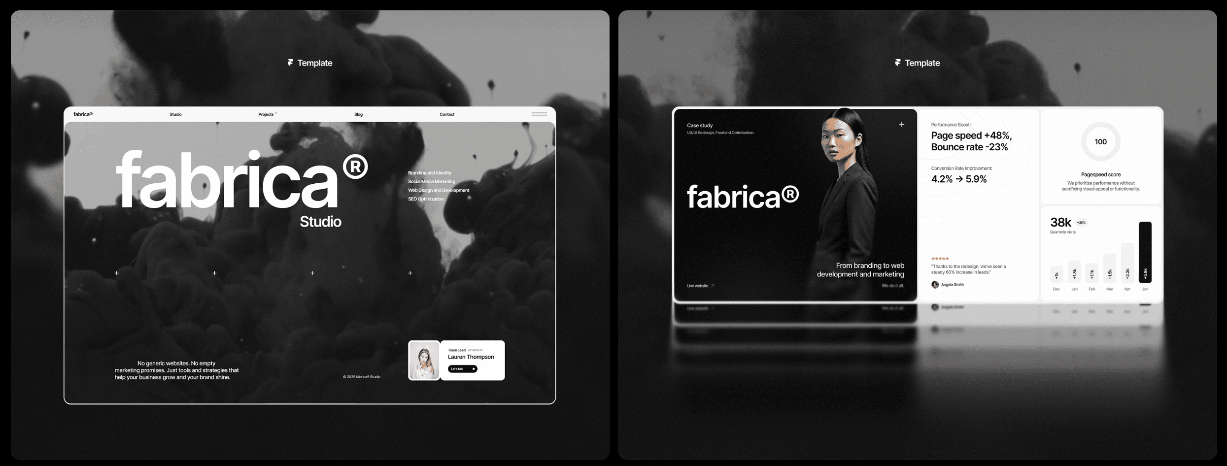
Fabrica and Sombra shine when style and mood sell the brand
Fabrica brings an editorial look with asymmetric layouts that give portfolios an artful edge. Photographers and art directors get big images that feel open instead of boxed in. Max image widths near 1600px keep mobile load times reasonable, so style doesn’t slow the page.
Sombra defaults to dark mode with bold, high-contrast type. It suits developers and 3D artists who want room for tech stacks and performance stats next to the work. It uses heavier typefaces and motion, but reduce animations on phones, especially parallax, to keep scrolling smooth.
These templates put mood first, not raw speed or feature lists. Choosing one is about what clients need and what sells right now.
Picking a portfolio template should match goals, not taste. Launch fast with Viral, tell richer stories with Portfolite, keep it minimal yet premium with Focus Flow, aim for editorial polish with Fabrica, or show technical chops with Sombra’s showreel energy. Get a version live within 24 hours, then refine based on real visitor behavior.
- Match the template to what matters most for your projects or clients.
- Use affiliate links when they save setup time.
- Publish a draft fast, then tweak after real feedback.
Leave a Reply