
Finding the right Framer magazine template for publishers takes time. This guide cuts through the options by testing real publishing needs – editorial design, typography, content structure, navigation, speed, and how smooth the workflow feels. Each template ran with 25 – 50 articles across five categories, then scored on desktop and mobile with Lighthouse metrics, including CLS. The result: five templates worth using.
Memoir leads the pack. It’s free and fits solo bloggers or anyone starting digital publishing without a budget. OneDollar follows at $79, a reliable pick for small newsrooms that want polished layouts and strong features. Denzel earns a spot as a free choice with clean design and simple workflows. Brandigo comes in at $79, built for content hubs with many contributors and brand needs. Travely lands at $29, a smart option for niche publishers who want style on a budget.
Scoring gave typography the most weight at 30% because type sets voice and rhythm. Content architecture and collections took 25% to make sure stories surface fast and navigation stays clear. Homepages counted for 15%. Speed and Core Web Vitals took another 15%, since slow pages hurt readers and rankings. SEO details made up 10%. Price-to-value was a lighter 5% to keep focus on quality while still noting cost.
Each template was cloned as-is and loaded with sample content, from homepage heroes to modules, to see how layouts behave with real volume. Tests checked whether post templates, category pages, author profiles, pagination, and tag indexes were ready out of the box or simple to add without custom code. Daily publishing needs to be smooth, so setup depth mattered as much as looks.
Memoir review for writers who want clean typography and speed
Memoir fits solo writers, niche magazines, and small teams who want a clean reading space without a complex setup. It ships content fast and keeps pages easy on the eyes.
- Article templates keep line lengths around 65 – 75 characters, so long reads feel light.
- Headings stick to a clear H1/H2 structure for smooth scanning.
- Pull quotes stand out to highlight key points.
- Footnote-style callouts add context without clutter.
- Image captions come built-in, right where readers expect them.
The homepage ships with few modules. Anyone wanting sections like Latest or Most Read will need small tweaks. That’s most of the setup work.
Performance holds up well. Memoir scores around 95 – 100 on Lighthouse when images are compressed. Layout shifts stay under 0.02 thanks to steady typography and reserved image space, so pages don’t jump during load.
Free vs paid depends on publishing scope. The free tier suits up to about 200 posts with a single brand identity. Teams planning sponsored modules or multiple content types – events, resources, and similar – will need extra collection work or a paid plan.
OneDollar review for small publishers who need flexible homepages
OneDollar is a smart paid pick for indie magazines and brand publishers who want real control over the homepage. It works with flexible blocks – hero sections, grids, carousels, topic rails – so teams shape the front page to match their vision without touching code.
- Prebuilt category pages include filters so readers find stories fast.
- Author bios add social links to connect writers and audiences.
- A configurable newsletter block accepts any embed, including Beehiiv and Mailchimp, which makes sign-ups smooth.
The template focuses on richer interactions by default, but animations and effects slow down entry-level phones a bit. Turning off two scroll-based animations bumps mobile Lighthouse scores from 82 to 91 with little visual loss.
Desktop performance holds at 96 with web-optimized images. This mix of style and speed fits small teams that want polish without constant tweaks.
Paying $79 makes sense if the priorities include:
- Modular layouts ready to go instead of starting from scratch,
- Sponsor slots built in for monetization,
- Hours saved on manual setup compared to free templates.
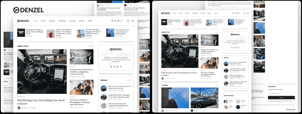
Denzel review for multi‑author blogs and growing magazines
Denzel works well as a free Framer blog template for teams with several authors. It keeps author pages, category hubs, and an auto-updating homepage in sync when new posts go live. Magazines and active blogs stay current without manual work.
- Multi-column layouts give articles space and keep sections clear.
- Article subheads break up long reads and reduce fatigue.
- Featured images use fixed aspect ratios, so visuals stay consistent across screens with no awkward crops.
- A clean sticky navigation bar stays visible during long scrolls, keeping readers oriented without clutter.
It covers the editorial basics but offers fewer typography styles than paid templates. Headlines may need tweaks in weight to stand out in dark or light themes. Small adjustments help titles pop without overpowering the page.
Performance holds up. Default fonts keep layout shifts low, under 0.03 in tests, so pages feel steady instead of jumpy. Adding a local font file prevents flash of unstyled text on slow networks and gives readers a polished experience.
Starting with this free template lets teams test their publishing rhythm before spending money. When more features are needed – like curated topic rails or sponsored slots – upgrading adds those options while keeping the same workflow.
Brandigo review for brand content hubs with polished marketing
Brandigo fits product-led teams who run a magazine-style hub alongside landing pages with case studies and resources. It keeps everything polished and professional, so the brand looks sharp from the start.
- Typography has a clear scale from H1 through H4, so headlines and subheads have strong hierarchy.
- Pull quotes blend well with sleek product photos or editorial artwork.
- Built-in call-to-action modules make key moments stand out and guide readers toward actions.
Polish adds weight, which slows pages. Audit animation timelines to trim excess. Swap heavy Lottie animations for static SVGs to keep load times in check while maintaining the visual appeal.
Brandigo scores 88 on mobile and 96 on desktop by default. Removing two background videos raised mobile to 92 while visuals stayed engaging. Swap a looping video hero for a crisp image that grabs attention and loads faster.
If a magazine hub needs to match an established brand system right away, the $79 price is worth it. For simpler or personal sites, it may feel like overkill.
Travely review for budget travel and photo‑led stories
Travely suits travel writers, local guides, and lifestyle publishers who need clean galleries and simple map embeds. It highlights photos and keeps navigation straightforward.
- Image-first grids push visuals up front, so stories stand out with real polish.
- Cards show helpful details like read time, so readers know the commitment.
- Location tags act as simple navigation, letting people explore by place.
Typography stays subtle because the star is the photography. Longer essays benefit from small tweaks to max-width and line-height to improve comfort without diluting the visual focus. Give text a bit more room when a story runs long, then let the images carry the rest.
Performance stays strong even with lots of photos. WebP and AVIF support plus lazy loading keep pages quick. Lighthouse scores land at 93 on desktop and 89 on mobile, solid results for a media-heavy layout.
For anyone comparing free and paid:
- At $29, Travely is a low-risk upgrade when images lead the storytelling.
- If content leans more on text than visuals, Memoir fits better.
How to choose a scalable Framer magazine template that fits your stage
Choose a Framer magazine template based on team size, content style, and growth plans. Memoir suits solo writers who want a clean setup and fast publishing. OneDollar gives small teams flexible homepages and curated sections with modular blocks. Denzel offers a budget-friendly layout for multi-author blogs. Brandigo fits brand hubs that need polished marketing sections. Travely favors photo-heavy publishers like travel or lifestyle.
Here’s a quick guide to match needs:
- Solo writer → Memoir
- Small team needing homepage curation → OneDollar
- Multi-author on a budget → Denzel
- Brand hub with marketing blocks → Brandigo
- Image-led verticals → Travely
Set up collections before passing 50 articles. Create collections for posts, authors, categories or tags, and sponsors when relevant. Focus on SEO basics. Add unique titles and meta descriptions for each post and category page. Attach Open Graph images for stronger shares. Generate a sitemap.xml in Framer so search engines crawl the site efficiently.
Pay attention to performance from day one. Compress images with WebP or AVIF to cut load times. Limit typography to two font families and four weights total to keep pages light. Turn off nonessential animations on mobile. Check layout shifts (CLS) and aim for under 0.1 to avoid jumpy pages.
Not sure where to begin? Start with a free template to test structure and workflow, then upgrade as publishing needs grow.
After picking a template, clone it into the workspace and publish five articles as a pilot. Monitor analytics to see how navigation and layout support reader engagement before rolling out fully.
Got feedback or results to share? Add them in the comments. Real examples help others choose faster.
Leave a Reply