
From a founder’s seat, the pain is familiar. Hours lost to slow site setups, layouts that miss the brand feel, and leads slipping away because conversion wasn’t built in. For creators and small brands trying to stand out, these issues stall growth before it starts. The right Framer lifestyle template isn’t only about looks – it blends style with story and makes each click matter.
A few things separate strong templates from the rest. Visual coherence keeps pages feeling unified instead of stitched together. Story structure shapes the journey: a clear hero to hook attention, content sections that build interest, and proof that earns trust. Customization effort shows how fast a site goes live – less tweaking, more publishing. Performance tracks Core Web Vitals so pages load fast and visitors stick around. Conversion readiness covers CTA placement and lead capture that’s easy to find without pressure.
Testing stayed fair and consistent. Each template started fresh in Framer with the same demo content: a short bio, six images, and two offers. Fonts and color tokens stayed the same too, so differences came from layout and design choices, not branding. Lighthouse ran on desktop and mobile at normal speed and throttled 4G to mirror real browsing.
Pricing spans a wide range, from $19 up to about $250. This list keeps only premium picks worth the spend for creators or brands that want real impact online. Affiliate links appear when available to keep things clear and to help readers get straight to the right option.
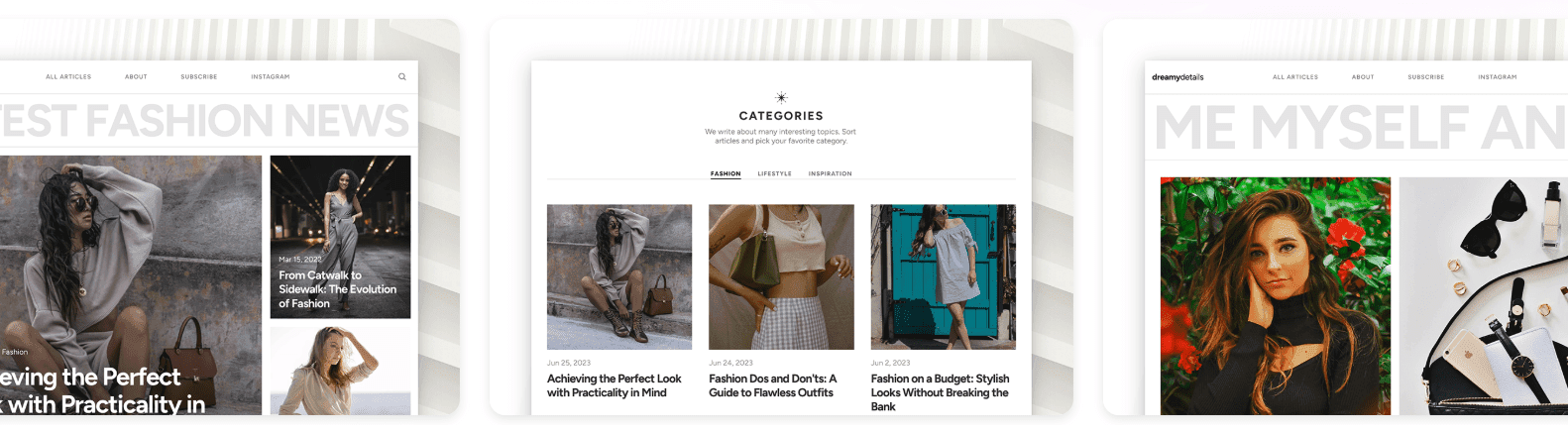
DreamyDetail is ideal for aesthetic creators who want speed and clear CTAs
DreamyDetail uses soft gradients and generous whitespace to create a fresh, refined look. Layered images float across the page and keep things light. Fashion, wellness, and travel brands get space to show style without overwhelming visitors. The hero section uses overlapping cards that pull attention to the main call to action. Clear, no clutter.
Telling a founder story is straightforward with the built-in About block. The timeline and quote carousel help share milestones, values, and proof from real customers. No custom code needed. The structure supports the story so the voice stays front and center.
Customization is quick. Edit color tokens and typography presets in under ten minutes. Change one global style, and it updates cards, buttons, and headings sitewide. It saves hours across multi-page builds and helps teams ship faster.
Performance holds up. Lighthouse scores land in the 90s on mobile. With optimized images, largest contentful paint sits around 1.9 to 2.2 seconds. Scroll effects use CSS instead of heavy JavaScript, which keeps motion smooth and load times tight.
Conversion features are ready out of the box. The hero pairs a strong primary CTA with a softer secondary choice to match different visitor intents. A sticky footer signup stays visible during scroll. Modular pricing and offer sections fit checkout handoffs or calendar booking embeds for service brands.
Lifecoach offers the strongest narrative flow for session‑based businesses
Lifecoach uses a clean mix of serif and sans-serif fonts that feels professional and warm at the same time. Colors add cozy accents, so the site looks inviting, not stiff or corporate. Portrait-first layouts put each coach’s brand up front, which gives a credible, human presence that doesn’t read as sales-heavy.
The page flow guides visitors through a clear client journey. Ready-made blocks outline session roadmaps, show outcomes in a simple grid, and highlight before-and-after transformations. These pieces work together to build trust fast. FAQ accordions answer common questions while keeping the page tidy and easy to scan.
Setup stays quick. Pre-linked buttons connect to booking tools like Calendly and Cal.com, and email capture forms ship ready to use. Swapping brand colors and images takes about an hour in most cases, so coaches can get an MVP live quickly and skip the technical hassle.
Performance holds up because animations stay light. Compressed headshots and crisp SVG icons keep mobile stable across repeat tests, with no jumpy layout shifts or slow scroll delays.
Conversion elements show up early. Social proof sits above the fold, with partner logos or short testimonials drawing attention right away. A mid-page call to action nudges visitors to book, and tiered offer cards present clear options for one-on-one coaching, group cohorts, or digital downloads. The structure makes it easier for visitors to move from browsing to booking.
Elara brings an editorial magazine feel for frequent publishers
Elara feels like a modern editorial magazine built for frequent publishing. It uses a clean grid with clear type, so headlines stand out and long reads stay comfortable. Long line lengths give room for essays and photo-heavy posts, which makes reading relaxed, not cramped.
The layout puts a featured post front and center to pull readers in fast. Category tags surface topics by interest, and related-post rails keep the next click obvious. This path keeps readers moving through stories instead of leaving after one page.
Setup is simple. Collections for posts, categories, and authors come ready to go. Swapping demo content for real content means importing CSVs and replacing images. No complex steps.
Performance holds up on busy homepages. Images lazy-load on scroll, and content loads in chunks to avoid big waits. Modern formats like WebP and AVIF help cut file weight. Tests showed mobile LCP around 2 to 2.4 seconds on slower 4G.
Conversion spots sit where they help without breaking focus. Newsletter forms appear in the sidebar and at the end of articles. An optional content-upgrade section supports freebies or lead magnets. In-article CTAs match the reading flow and grow the email list without pressure.
Awe delivers a polished e‑commerce storefront for lifestyle brands
Awe pulls visitors in with full-bleed product photos that make each item stand out. Product pages go beyond specs – they show materials, sizing guides, and lifestyle images so shoppers can picture the pieces in everyday use. The design feels polished and trustworthy, a strong fit for lifestyle brands that want products to take center stage without clutter.
The brand story goes deeper than carts and prices. A personal note adds warmth, and sustainability sections explain eco-friendly efforts in plain terms. These details build quiet credibility. Process photos show how products come together, so casual browsing becomes a closer look at the team’s values.
Updating the catalog stays simple. Product cards, variant selectors, and the cart drawer work like modular blocks. New SKUs slide in quickly by duplicating an item in the CMS and swapping images or details – no complicated steps. Teams keep the store fresh without struggling with the tools.
Speed holds up across screens. Responsive images fit the device, and deferred scripts keep pages snappy. Compressed assets make the cart feel instant, which matters on phones. The layout stays steady with minimal shifts, so checkout doesn’t jump around.
Conversion tools show up where they matter without pressure. Large add-to-cart buttons invite action, sticky callouts cover shipping perks and return policies, and trust badges ease last-minute doubts. Integrations hand off to Shopify Buy Button or Stripe links smoothly, so buying feels quick and effortless.
Estancia is a minimalist portfolio pick for photographers and refined brands
Estancia closes the list with a calm, confident look photographers, studios, and polished personal brands will value. Minimal type and muted colors set a quiet stage. Full-bleed galleries take the spotlight without noise. The work feels expensive, and setup doesn’t drag on with endless layout tweaks.
The story stays clear. A compact About section pairs with Process and Proof blocks to keep focus on real projects and outcomes. The case study module adds trust by highlighting roles, tools, and results, while the flow stays simple with no extra code.
Customization moves fast with drag-and-drop gallery grids in 1:1, 3:2, and 4:5. Lightbox makes viewing easy. Swapping a batch of images and updating copy often wraps up in under an hour. Creatives get live quickly without technical roadblocks.
Estancia stays lean. Sparse scripts and native lazy loading keep galleries quick. Clean CSS helps images render sharply on every device. Mobile scores stay strong, which matters when most visitors browse on phones.
Conversion-focused details help turn visits into leads. An inquiry form includes project budget selectors and project type tags to route leads by interest. A persistent footer CTA keeps contact info visible as people move through the site, which supports steady inquiry growth without pressure.
Choosing Framer templates for influencers or small brands depends on the goal: booking calls fast like Lifecoach, publishing on a steady schedule like Elara, selling with ease like Awe, expressing style like DreamyDetail, or presenting a refined portfolio with Estancia.
Explore the ranked picks through the links. Track key signals such as Largest Contentful Paint, time to first lead after launch, and the moment the first sale or booked call lands. Those metrics show whether the template fits the brand’s pace.
Leave a Reply