
Founders who want to launch fast and convert faster need a clear list, not a maze. Here it is: Fade sits at number one, then Fabrica, Jet, Suprema, and Sombra. These picks weren’t random. Each template was stress-tested with the same priorities teams care about when going live.
Conversion-focused layouts matter most. If a page turns visitors into users, it earns a spot. Speed and performance come next. Every millisecond affects attention and bounce. Flexibility for customization prevents design dead ends, and responsiveness keeps layouts sharp on phones and desktops. Each template also maps to a clear use case, from SaaS trials to personal branding, so the fit makes sense.
Testing stayed practical. Each template was duplicated in Framer and filled with the same 250-word SaaS hero, an SVG product image, and an embedded video. Publish size, Lighthouse Mobile scores, and time-to-first-edit showed how they hold up under real content, without relying on heavy visuals that slow pages down.
One note on links. Some picks include affiliates. Rankings reflect hands-on tests focused on usability and speed, not payouts.
By the end, choosing a template for a waitlist push or a new product page takes under five minutes. Pick the one that matches the timeline and the goal, then ship it.
IndieHackers
IndieHackers helps founders launch product pages fast and show progress publicly
IndieHackers is designed for startup founders and builders who want to launch quickly and share their journey in public. The layout puts the product first. A strong hero introduces the idea, followed by sections that explain features, traction, and roadmap updates. Social proof elements like user testimonials and product metrics appear early, which helps build credibility for early-stage startups that need trust before conversions.
Performance stays strong despite the richer storytelling layout. The base page typically ships around 420–480 KB gzipped, keeping load times quick enough for visitors arriving from platforms like Product Hunt, X, or Indie Hackers. Mobile Lighthouse scores often land between 88 and 92 depending on how many images or product visuals are included.
Customization is straightforward for founders who iterate often. Feature grids, roadmap sections, and update modules make it easy to share progress as the product evolves. Global style controls manage fonts, colors, and spacing so the design stays consistent while new features or milestones are added. Built-in testimonial areas and product update sections help startups highlight growth without constantly redesigning pages.
This template works best for indie hackers, SaaS founders, and early-stage startups launching new products. The structure supports storytelling around product progress, user feedback, and launch momentum, helping founders build trust while growing their first group of users.
DreamyDetail
DreamyDetail gives lifestyle creators a polished space for fashion storytelling
DreamyDetail works best for fashion creators and lifestyle bloggers who want visuals to lead the experience. The layout emphasizes photography and editorial storytelling. A wide hero image introduces the brand immediately, followed by article cards that keep readers moving through curated fashion content. Categories appear early in the page, helping visitors explore style topics like outfits, beauty, and inspiration without digging through menus.
Performance stays balanced even with image-heavy layouts. After image compression, page weight usually sits around 420–480 KB gzipped. Mobile Lighthouse scores tend to land between 88 and 92, depending on how many images appear in the hero grid. Because Framer handles responsive image scaling automatically, photos stay sharp without slowing the page too much.
Customization feels natural for creators who update content often. The layout includes structured article cards, category navigation, and author-focused sections that make personal branding easy. Fonts, colors, and spacing run through global style controls, so creators can refresh their visual identity without redesigning every page. Newsletter sections integrate smoothly with Mailchimp or ConvertKit for growing audiences.
This template suits fashion bloggers, lifestyle creators, and digital magazines that publish frequent articles. The design keeps attention on photography and storytelling while staying clean enough for readers who browse quickly on phones.
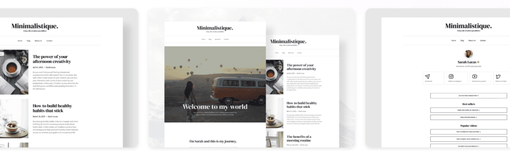
Minimalistique
Minimalistique keeps blogging clean, calm, and focused on the story
Minimalistique is built for creators who want a quiet, minimal design that lets content speak first. The layout removes visual clutter and focuses attention on writing and photography. A simple hero introduces the blog, followed by article previews arranged in a balanced grid that keeps browsing smooth across desktop and mobile screens.
Performance is one of its strongest advantages. With minimal scripts and lightweight images, the base page usually lands around 240–300 KB gzipped. Mobile Lighthouse scores regularly reach 95 or higher. Readers see content quickly, which matters for blogs where engagement depends on immediate readability.
Customization is simple and structured. Global typography controls adjust headlines and body text across the entire site, while color tokens keep the palette consistent everywhere. Author profiles and category sections come ready for creators who want to build a recognizable personal brand. Newsletter blocks connect easily with Mailchimp so readers can subscribe without interrupting the reading flow.
Minimalistique fits personal bloggers, writers, and creators who publish essays, lifestyle content, or visual journals. The design stays restrained and elegant, helping visitors focus on ideas rather than interface.
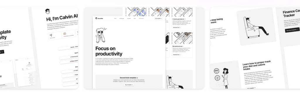
FocusFlow
FocusFlow helps creators turn productivity content into structured digital products
FocusFlow is built for creators who sell productivity systems, Notion templates, and digital tools. The layout centers on a clear personal brand introduction followed by product sections that guide visitors from discovery to purchase. A prominent hero introduces the creator and their method, while structured content blocks present guides, templates, or productivity resources in a clean and organized way.
Performance remains strong thanks to the minimal visual style. The base page usually ships around 300–360 KB gzipped, which keeps load times quick even on mobile networks. Lighthouse Mobile scores commonly land between 92 and 95. Since most sections rely on lightweight illustrations and structured layouts instead of heavy media, pages stay fast as creators add more content.
Customization stays flexible for creators who regularly update their offerings. Product cards, resource libraries, and content sections can be swapped quickly when new templates or guides launch. Global typography and spacing controls keep the design consistent across landing pages, resource hubs, and product listings. Built-in link collections also make it easy to connect multiple digital products from a single creator hub.
This template works best for Notion creators, productivity educators, and digital product builders who sell templates, courses, or downloadable systems. The structure keeps the focus on teaching and tools, helping creators turn their expertise into a clear storefront without building a complex site from scratch.
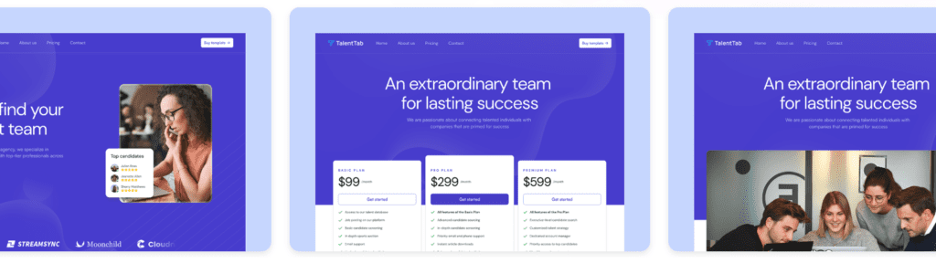
TalentTab
TalentTab gives recruitment agencies a clean site for presenting talent and winning clients
TalentTab is designed for recruitment agencies that need a professional web presence without building a complex site from scratch. The layout focuses on trust and clarity. A bold hero introduces the agency and its value proposition, followed by sections that highlight services, candidate expertise, and company results. Testimonials and client logos appear early, which helps build credibility when potential clients evaluate new hiring partners.
Performance stays solid even with service pages and team sections included. The base page usually ships around 360–420 KB gzipped, keeping mobile loading times quick enough for busy hiring managers browsing on phones. Lighthouse Mobile scores often land between 90 and 93. Since most sections rely on structured layouts rather than heavy media, the site remains responsive as agencies expand service pages or add more team profiles.
Customization is straightforward for agencies that update offerings frequently. Pricing tables, service descriptions, and testimonial sections can be edited quickly as hiring packages evolve. Global typography and color controls keep branding consistent across the homepage, pricing pages, and contact sections. Built-in forms integrate easily with tools like Mailchimp, HubSpot, or Formspark, making it simple to capture new client inquiries.
This template suits recruitment agencies, talent consultancies, and HR service firms that want a polished online presence without investing weeks in custom design. The structure focuses on credibility, services, and clear calls to action, helping agencies convert visitors into hiring conversations.
Fade is the fastest path to a clean, conversion‑first SaaS launch
Fade is a strong pick for startups that need clean, conversion-focused SaaS pages built fast with Framer templates. The hero section gets straight to the point. A sharp value prop leads, a clear primary CTA sits beside it, and visitors know what to do next. A social proof row follows to build trust. A pricing anchor keeps attention on the offer. Fade avoids autoplay hero videos, which helps lower bounce on mobile where distractions ruin sessions.
Performance holds up. The shipped page is about 290 KB gzipped, so it loads fast. With default animations off, Lighthouse Mobile Performance usually lands around 95 – 97. First contentful paint shows up in under 1.8 seconds on simulated 4G, so people see something quickly instead of a blank screen.
Design edits stay tidy thanks to global style tokens for fonts, colors, and spacing. Changes apply across the site, so no hunting for stray elements. Pricing blocks and testimonials swap in easily as the offer evolves. Three hero options cover different needs: centered headlines, split layouts with copy and visuals, or a product-forward variant. Layout stability holds across all three.
This suits SaaS teams focused on first signups or paid trials. The layout stays minimal, avoids over-editing, and helps ship sooner. It pairs well with Calendly CTAs for demo scheduling or Stripe embeds for checkout, so teams get a steady base when speed and conversions matter.
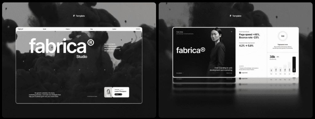
Fabrica offers flexible sections for teams that iterate weekly
Fabrica works well for teams that keep tweaking and testing landing pages without rebuilding them. It’s built around modular sections, so swapping content is quick. That helps with A/B tests that switch between benefits-first and features-first messaging. The library includes feature grids and comparison tables, which suit SaaS products with multiple plans or add-ons. FAQs include schema-ready markup spots, which gives SEO a small lift while answering common questions.
Performance stays strong even with flexible components. After image compression, the base page size is about 430 KB gzipped, light enough for fast mobile loads. Mobile Performance scores sit around 90 to 92. Framer’s native interactions power the accordions, not third-party scripts. Less extra code means faster response as new sections ship week after week.
Customization feels easy. More than twenty pre-styled components are ready to drop in content. Light and dark mode toggles work through the color system with no extra steps. A single theme control adjusts typography across the site, so fonts stay consistent across updates.
SaaS teams with several pricing tiers get clear comparison layouts, plus areas tailored for objections and add-on explanations. It fits teams that prefer steady, incremental improvements over locking a final design early.
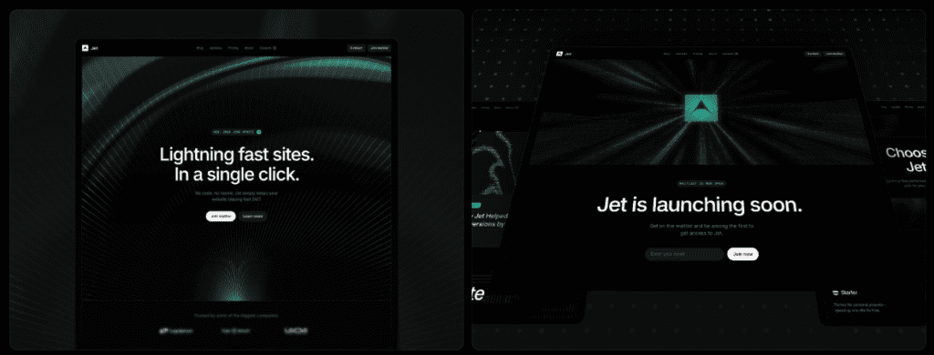
Jet brings bold visuals for product launches and waitlists
Fast attention, bold visuals, and a hero section built to convert. Jet puts a countdown timer front and center, with one clear call-to-action aimed at collecting emails. Visitors see the offer, feel the urgency, and sign up before launch day. A launch timeline and a strip of press logos add credibility without turning the page into a wall of text. It’s a good fit for pre-release moments where excitement matters more than long explanations.
There’s a tradeoff. High-res device mockups and rich visuals push gzipped page weight to roughly 650 – 720 KB. That size drops many mobile performance scores into the low 80s unless images get compressed. Teams need to choose between ultra-crisp imagery and faster loads, especially for phone traffic where patience runs thin.
Customization stays simple and clean. Gradient overlays add depth. Scroll-triggered reveals give motion as people move down the page, so the layout feels lively without getting noisy. Email tools swap in easily. Framer Forms or ConvertKit embeds both slot in without breaking layouts or shifting elements during sign-up.
Best use case: fast-launch campaigns like Product Hunt drops or tight waitlist pushes where every email matters before the product ships. Jet skips long feature tours and complex pricing blocks. It aims for quick conversions driven by visual impact and urgency, while more detailed SaaS pages remain better suited for deep feature breakdowns and multi-plan pricing.
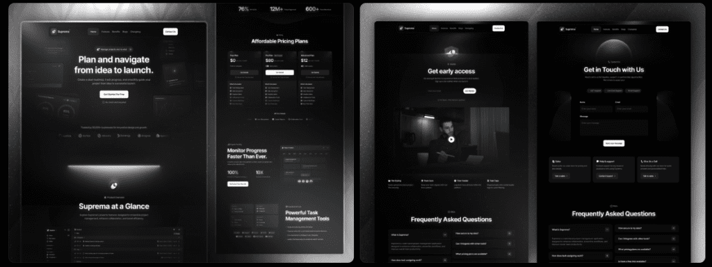
Suprema delivers a polished corporate feel for established SaaS sites
Suprema suits SaaS teams that have moved past the scramble phase and want a refined, corporate-style site. It’s built for multi-page setups where brands go deep with their story. Expect detailed use-case pages plus rich resource hubs, including blogs and case studies. This structure builds trust and authority when growth depends on more than a quick signup pitch.
The conversion layout favors long-form storytelling with space for customer proof and technical resources. A sticky sub‑nav keeps visitors oriented through nested content, so they find what they need without wandering. Longer sessions and deeper exploration often follow. Confidence grows, and conversions rise over time without heavy-handed prompts.
Performance lands in the middle. The base page is about 520 KB gzipped, heavier than lean templates due to richer type and a broad icon set. Even so, Mobile Performance scores sit around 88 – 90. Caching helps a lot on return visits, which keeps the experience smooth for brands that can’t risk sluggish pages.
Customization is a strong point for teams with complex sites. The multi-page setup reuses shared components to keep upkeep sane, while CMS-ready blog and case study templates speed up content work. Localization is straightforward too. Duplicate pages, apply global styles, and roll out international versions without reworking layouts from scratch.
It fits growing SaaS companies that want a polished presence with clear trust signals, including security badges, compliance notes, and prominent customer logos. Navigation points users quickly to docs and support, which matches expectations for a mature product rather than a bare-bones startup site.
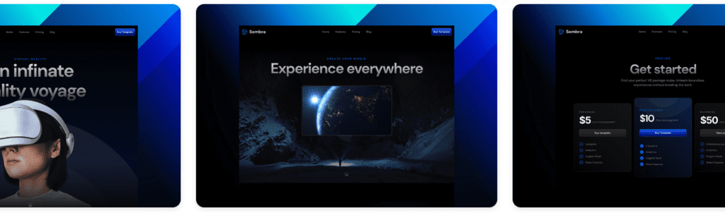
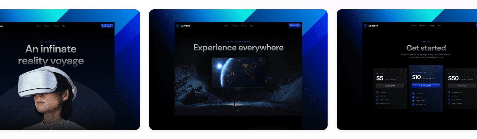
Sombra is a simple creator template that still sells
Sombra works as a personal-brand and solo-creator template that keeps sales clear and direct. The hero locks in identity and offer, with tight social proof that builds trust without clutter. Checkout or booking CTAs stay front and center, which suits creators selling through Gumroad or Stripe embeds. A link-in-bio style grid pulls in other platforms, so small product sellers keep everything tidy and effective.
Speed holds up well. The page stays light at about 260 to 320 KB gzipped, and mobile scores land around 94 to 96 in common tests. Animations stay minimal, so older phones don’t burn battery or stutter. Visitors get a smooth load and quick taps.
Customization stays friendly for non-developers, with useful control where it counts. Color palettes swap fast, avatar modules personalize the site in seconds, and the built-in posts or notes feed grows an audience on the landing page. Gumroad or Stripe embeds slot in neatly without breaking the layout or shifting content, which helps solo entrepreneurs make quick edits beyond color tweaks.
Here’s the quick call: Jet handles launches and waitlists with bold visuals. Sombra fits personal brands that want straightforward sales pages without extra steps. Fabrica suits teams iterating week by week. Suprema fits deep content at scale to build trust. Fade targets fast SaaS signups. The next move is simple. Duplicate the template in Framer, replace the hero copy and the CTA to match the message, then publish a draft preview link and test it on a phone. Ship the basics first, then refine. This avoids endless edit loops and gets the launch live.
Leave a Reply