

Creators and founders want to launch courses fast, without fiddly setup. This roundup ranks the top Framer education templates for 2026 with a clear goal: save time and ship a course site that feels intuitive and polished on day one. Usability matters most, along with straightforward navigation, quick publishing, built-in lesson structures that fit real teaching needs, and reasonable costs.
These templates do more than look nice. They’re built for creator-first workflows, not flashy effects that slow pages down. Whether you’re a solo instructor testing one course, an established educator running paid cohorts, or an edtech team shaping a brandable learning hub, you’ll find a solid fit here. All options run inside Framer Sites with CMS and native analytics, so setup stays simple and there’s no need to bolt on a separate LMS just to launch.
Free vs. paid comes down to stage. Free templates help validate ideas and grow an audience without upfront spend. Once sales or sponsorships roll in consistently, paid templates save hours of build work and cut maintenance time. It’s a practical path that keeps attention on course content instead of tech headaches.
What makes a good educational template in Framer
A reliable Framer template for education starts with a clear three-level structure: Category or Track, then Course, then Lesson. Built-in breadcrumbs and back links keep people oriented as they move through content. Without those, visitors hit dead ends, engagement drops, and session depth shrinks.
Speed matters most on course sites, especially on phones. Aim for Largest Contentful Paint under 2.5 seconds. Heavy hero videos often push load time past 3 seconds and turn students away before they see the offer.
The CMS should include core collections: Courses with title, summary, level, and duration; Lessons with rich text, video URLs, and resources; Instructors with bios and links; and optional Testimonials for social proof. Leave pieces out and teams spend time patching gaps instead of teaching.
Conversion paths need to be ready on day one. Framer forms tied to Zapier or Make push leads straight into email tools. A primary call-to-action above the fold, plus steady enrollment buttons on course pages, keeps sign-ups visible where it matters.
Make customization fast to cut post-launch rework. Global color palettes and typography tokens let teams apply brand updates across the site without hunting for stray elements. Reusable lesson components speed new course creation. Responsive navigation with a clear “Start learning” button invites visitors in on any device.
Framer templates for real‑world course use cases
This rundown covers five Framer templates for education sites, what they’re good at, where they miss, and who they serve best.
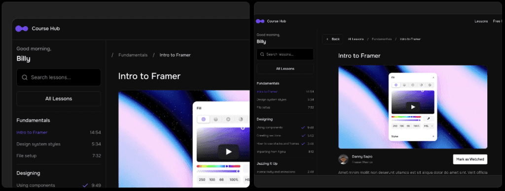
1 Course Hub (Free): Best for validation and content hubs.
Course Hub keeps things simple. Clean course lists, clear lesson pages, smooth video and resource embeds. It loads fast and costs nothing, which makes it handy for early-stage publishing. It doesn’t include checkout, and the design system stays basic as the site grows. Works well for up to 20 lessons while building an email list before turning on sales.

2 MindlyAI ($59): Best for solo educators selling a flagship course.
MindlyAI focuses on polished sales pages with instructor bios, testimonials, and crisp curriculum sections that build trust. It assumes one primary course. Checkout requires manual embeds with Stripe or Lemon Squeezy/Gumroad. Strong fit when the plan is to sell one standout course with a refined pitch.

3 CourseSite ($59): Best for multi-course catalogs on a budget.
CourseSite is set up for multiple courses via CMS tags, filters, and tidy category pages. The lesson layout works, though long content may need tweaks. Sticky progress links would help, but they aren’t included. Good value for showcasing several courses without extra fuss.

4 Coursey ($199): Best for teams/startups needing brand polish and sections for cohorts, pricing tiers, and features.
Coursey brings strong hero sections, comparison tables, and detailed curriculum blocks built for complex setups like cohorts or tiered plans. It costs more, and the heavier visuals require careful image optimization to keep mobile pages fast. Suited to startups that want a professional learning platform look.

5 Educore ($59): Best for bootcamps or workshops with schedules.
Educore adds event-style sections, instructor cards, and syllabus blocks shaped for live sessions and intensive workshops. It ships with fewer lesson patterns, so reusable components will likely need to be created before a full course launch. Solid choice for scheduled programs over evergreen classes.
How to choose between free and paid templates
Free templates like Course Hub make sense when an email list sits under 1,000 subscribers or the conversion path isn’t clear yet. Money saved matters more than fancy design while testing if the course topic actually resonates.
Paid templates start paying off once they save at least five hours of setup, including sales pages, curriculum layouts, and pricing tables. A one-time $59 spend breaks even fast if time is worth $12 per hour or more, turning cost into time saved.
Monetization plans drive the template choice. Selling one-off courses with Stripe embeds works well with simpler setups. Cohorts with applications and waitlists need a more structured layout. Sponsorships benefit from a dedicated media kit page, and lead generation improves with free modules tied to email capture forms.
Traffic strategy matters. Paid ads call for speed and conversion focus, with fast-loading sales pages and strong calls-to-action above the fold. MindlyAI or Coursey suit this, keeping pages fast and focused.
Team setup changes the pick too. Solo creators who update content weekly often prefer straightforward designs like Course Hub or CourseSite to stay nimble. Startups with multiple stakeholders and custom section needs tend to favor Coursey’s design system for smoother collaboration.
How to set up and ship your course site fast
Launching a course site with Framer templates doesn’t need extra layers of setup or tech. Starting with a free template helps people test an idea with low risk. After the offer feels solid and the structure works, a paid template adds speed and polish.
Import a template, then rename CMS collections to match site language. Use labels that make sense to the audience, like Tracks instead of Categories, or Lessons if that fits better. Create three sample lessons right away to confirm the navigation path makes sense and breadcrumbs keep visitors oriented.
Set up email capture next. Connect Framer Forms through Zapier or Make to tools such as ConvertKit or Mailchimp. Use a clear success message that promises one helpful lesson each week. It sets expectations early and builds trust.
If selling is part of the plan, add Stripe payment links or Lemon Squeezy or Gumroad buttons on course pages. If sales aren’t ready yet, place a Join waitlist button and ask a few qualifying questions to learn what buyers want.
Run a performance pass before launch. Compress hero images under 200 KB. Remove autoplay videos on mobile. Test speed with PageSpeed Insights and aim for under 2.5 seconds LCP. Faster pages keep students engaged.
Break launch into stages to keep momentum steady without overwhelm:
- Week 1: Publish the course hub with five lessons to establish a real content base.
- Week 2: Add sales pages and an automated email sequence to nurture leads.
- Week 3: Collect feedback from early users and refine lesson layouts. Try sticky tables of contents or resource blocks for easier navigation.
Mapping the work across three weeks turns a big project into manageable wins. Start now instead of waiting for perfection. Each small task brings the site closer to sharing knowledge in a clear, useful way.
Leave a Reply