
Founders don’t need custom code to ship a fast, polished blog. Speed and clear design aren’t nice-to-haves anymore. Slow pages push people away before the message even loads. Aim for a Largest Contentful Paint under 1.5 seconds to keep visitors on the page and willing to click deeper.
Framer’s recent updates make launch day simple. Native CMS Collections organize posts and pages. Built-in sitemap.xml and Open Graph controls replace a pile of plugins. Growth comes from organic traffic and qualified email signups, so the template should highlight calls-to-action without clutter.
SEO now relies on solid markup, not just keywords. Clean HTML, semantic headings, and structured data need to live inside the editor. Templates that surface these elements from the start save time during setup and remove guesswork.
This guide covers five Framer templates for different outcomes. Launch fast, build search momentum, or create a bold brand showcase. Pick the path that fits your goal and ship without slowdown.
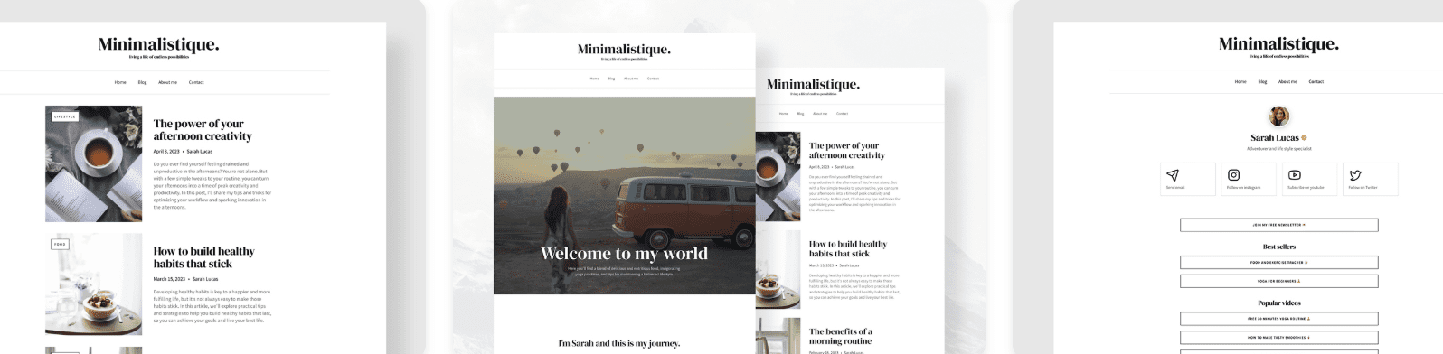
1. Minimalistique keeps performance first for focused writing
Minimalistique uses an ultra-minimal grid that feels open and calm. A single column holds the article body, set to roughly 70 – 75 characters per line. Long-form reading stays smooth and free of clutter. It sticks to system fonts instead of custom web fonts, which keeps pages light and fast to load.
It suits founders publishing thought-leadership pieces or product changelogs where words matter more than visuals. Paired with B2B SaaS positioning pages, the template lets ideas come through clearly without heavy imagery or animations fighting for attention.
Performance stays tight. When built in Framer, initial HTML and CSS bundles usually land under 100 KB. With no hero videos or oversized images in the way, Largest Contentful Paint often hits around 0.9 to 1.3 seconds on capable mobile devices. Visitors see content fast and stick around.
SEO comes ready to go. Clean H1 and H2 structure, plus fields for canonical URLs and Open Graph metadata, cover the basics. Article schema drops in through Framer CMS properties mapped to meta fields, so search engines get the right signals without extra setup.
Customization stays simple while the minimal look holds. Color tokens and spacing scales can shift to match a brand without wrecking the layout. Typography tokens swap at the global level, so a refresh takes about half an hour:
- Color tokens available for fast palette updates
- Spacing scales adjustable for tighter or looser layouts
- Global typography swaps keep structure intact
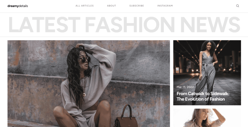
2. DreamyDetail adds editorial flair for visual storytelling
DreamyDetail adds editorial flair that fits rich storytelling and layered visuals. Magazine-style hero blocks grab attention and set up immersive narratives. Subtle parallax brings depth without distraction. Pull quotes and captions give long-form pieces space to breathe. Each post becomes a visual journey, not a wall of text.
Creative studios and product-focused founders get the most from it. Personal brands aiming to stand out with case studies or portfolio highlights find a strong match, where photos and captions build an engaging narrative together.
Performance stays smooth through lazy-loaded images, so pages don’t slow down upfront. Largest Contentful Paint usually ranges from 1.3 to 1.8 seconds, depending on hero image size. Convert images to WebP and cap widths to keep load times tight without losing visual impact.
SEO gets careful setup. Descriptive alt text supports accessibility and helps search engines read image context. Per-post meta fields let creators fine-tune titles and descriptions. For long posts, avoid going deeper than H3 headings to keep outlines clean and navigation clear.
Customization stays flexible with section variants that switch between visual-first layouts or more text-forward presentations, based on the content. Color styles and shadows come tokenized, so dialing effects up or down doesn’t require rework.
- Swap between post variants tailored for different storytelling moods
- Adjust color palettes with tokens without breaking design harmony
- Tone shadows up or down across sections for subtle mood shifts
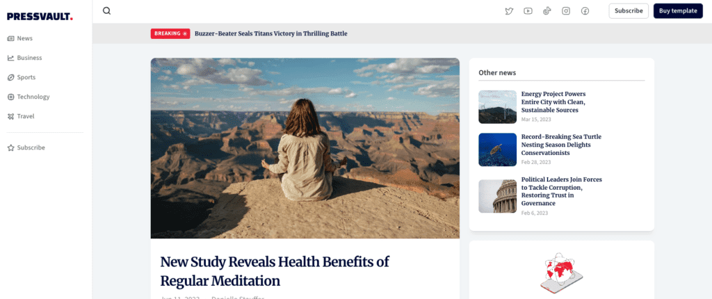
3. Pressvault builds credibility for updates and media needs
Pressvault nails a newsroom vibe that feels professional and friendly at the same time. Updates sit in compact cards, so each post fits cleanly and scans fast. Timestamps pop, giving instant context on when news went live. Author bylines sit upfront, which builds trust because readers know who wrote it. It doesn’t stop at posts either. Press kits for logos, founder portraits, and key facts turn it into a polished media hub.
It fits SaaS teams that post frequent release notes, PR updates, or investor news. One place, one format, no scattered files. The layout handles steady publish cycles while staying clear, which matters when updates arrive fast and still need to look sharp.
Speed holds up. Fonts stick to one or two weights plus system defaults, which lowers load time. Motion stays minimal, so visitors get straight to the info without waiting. Time To First Byte often becomes the main hurdle, so edge hosting helps keep Largest Contentful Paint near 1.1 – 1.5 seconds.
SEO gets a boost from predictable URL patterns like /updates/slug. Crawlers follow a clear structure, and people remember the path. Internal link blocks pull older posts into related areas, which cuts down orphan pages and keeps past announcements visible.
Customization stays simple. CMS Collections ship wired for updates, press materials, and resources. No layout rebuilds for small tweaks, since toggles handle style shifts.
- Switch between dense or airy card arrangements
- Choose preferred timestamp formats without code
- Manage multiple collections independently while keeping them aligned
Pressvault’s credibility-first approach suits teams that want reliable communication with a clean, fast experience.
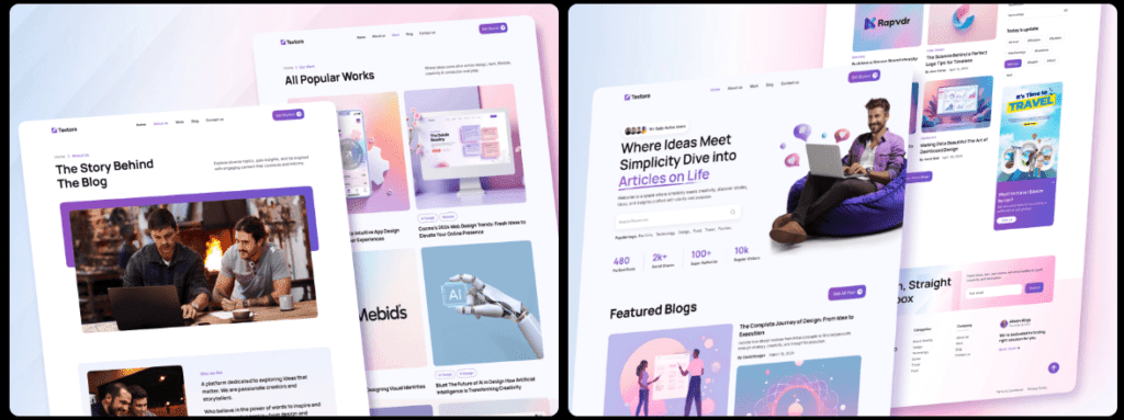
4. Textora suits long‑form technical guides with clear structure
Textora feels built for long, technical reading. A persistent sidebar or table of contents keeps sections a tap away, so readers can jump around without losing context. Code-friendly fonts and clear callouts make notes, warnings, and tips easy to scan. It reads like a well-organized manual on a single page.
It suits teams publishing technical blogs, API docs, or onboarding guides with step-by-step detail. Lots of headings? The structure keeps it tidy and easy to navigate. It also helps SEO. Internal links from the TOC build strong connections across the page, and breadcrumb-style navigation can improve sitelinks in search results.
Textora stays quick even with these features. The TOC relies on minimal JavaScript, so pages load fast instead of getting weighed down by scripts. Keep headings under about 60 characters to prevent layout shifts that annoy readers and hurt Core Web Vitals. Preloaded fonts smooth out rendering, so cumulative layout shift often sits in the 0.01 to 0.03 range.
Customization slides into normal writing flow. Component callouts highlight key info without fuss. Code blocks show snippets cleanly. Comparison tables line up data side by side. Assemble complex guides fast without looping in a designer for every tweak. Tech-savvy teams get to focus on the words, not the layout.
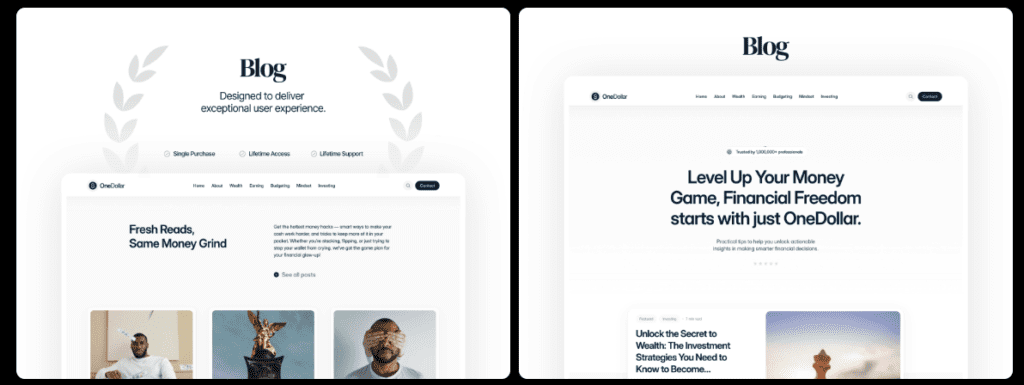
5. OneDollar helps you launch fast with an easy, lean starter
https://www.framer.com/marketplace/templates/onedollar/Rushing to ship a blog this weekend or test ideas fast? OneDollar gets out of the way. The lean layout keeps eyes on the message and pages load fast, so visitors read the headline instead of waiting. Setup stays simple, and swapping later won’t be a mess. Validate the content first.
Aiming to rank with in-depth guides or technical posts? Textora’s clean structure and table of contents help readers move through long pages. Search engines parse sections without friction. It organizes complex topics into clear chunks and keeps performance tight, which helps reduce bounce.
Founders who want visuals and light editorial details to carry the brand story should look at DreamyDetail. It pairs style with speed, so images support the message without dragging down load time. Strong presentation, steady performance.
These templates cut setup time and push toward results over the next 90 days. Framer blog templates stay easy to customize, so time goes into publishing, not code.
Choose the template that matches the near-term goal – launch fast, climb rankings, or lead with story – and publish this week.
Leave a Reply