

In the mid-2010s, building a WordPress site felt like walking through a maze. Themes controlled layouts and styles, so anyone without code skills hit walls fast. Shortcodes piled into pages as dense strings of text, and small edits turned into a chore.
Page builders promised relief, then locked sites into shortcode-heavy markup. Pick one tool, and switching later wrecked layouts. Change the builder, lose the work.
Agencies and freelancers took the brunt. Client tweaks meant hours in CSS or PHP. Feedback loops dragged on. Developers became gatekeepers, and projects slowed down.
Performance issues and theme conflicts showed up all the time. Teams had to choose between speed and clean code. Progress stalled.
Design stayed messy. No shared system kept spacing, fonts, or components in line. Each template stood alone and needed hand-tuning.
Previews didn’t match the live site. Editors published, refreshed, then fixed again. Trust in the editing experience wore thin.
Out of those headaches came a different approach. A founder, after years of facing the same roadblocks, pushed for a simpler way to build and edit WordPress sites.
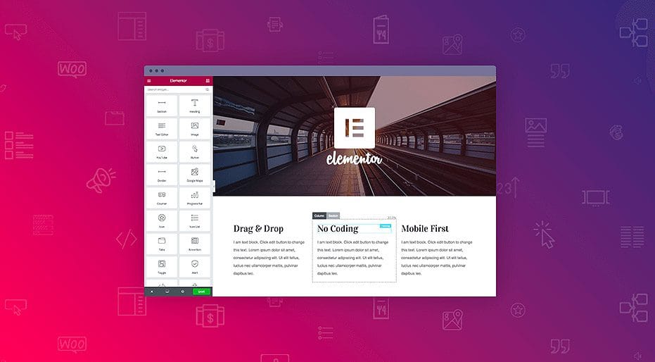
What WordPress looked like when Elementor appeared
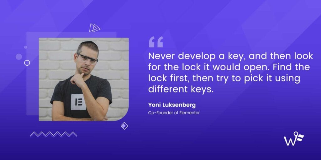
Yoni Luksenberg’s path to co-founding Elementor began well before the product existed. Running Pojo.me, a WordPress theme shop, gave him a close look at what broke after purchase. Layouts snapped out of place, small edits needed deep code, and simple tweaks turned into long support threads. A clear question formed: what if website building felt visual and straightforward instead of buried in technical terms?
His work crossed design and client services, a mix that shaped how he thought about tools. The goal was an interface anyone could read at a glance – not only developers, but designers and clients who wanted direct control over spacing, typography, and hierarchy. Plain labels helped. “Spacing” made sense right away, while vague terms slowed people down.
Agency work added another layer. Projects repeated the same building blocks again and again. Hero sections with bold headlines. Pricing tables laid out in tidy columns. Testimonials that followed familiar patterns. These weren’t one-off flourishes. They were reusable units asking to be dragged, dropped, and rearranged instead of rebuilt each time. Faster to assemble, easier to adjust, still open to creative choices.
Trust in WYSIWYG editing became a core push. The editor needed to match the live page exactly. No guessing, no “publish and hope,” no rounds of fixes to nudge pixels into place after going live. Less friction for teams and fewer surprises for clients.
He argued for thoughtful defaults that gave beginners a strong start while keeping room for experts. Sensible spacing rules, consistent type scales, and clear presets sped up new builds. Pros could override anything and fine-tune details when needed.
Feedback from Pojo customers highlighted a headache that kept coming back: switching themes wiped carefully crafted layouts. Work vanished with a single change. That problem shaped Elementor’s theme-agnostic approach, so designs stayed intact regardless of the theme sitting underneath.
As co-founder, Yoni influenced more than the interface. He helped shape how Elementor talked with its community. Real user problems translated into visible choices: what got built first, how features behaved, and which details mattered. The result stayed focused on solving everyday hurdles instead of chasing whatever sounded exciting that week.
Yoni Luksenberg’s path from agency design to product leadership
Ariel Klikstein joined Elementor with deep WordPress and PHP expertise, and he cared about reliability and plugin harmony. His focus went beyond code. He built systems that scaled without wobbling. Elementor’s core came from modular widgets, true building blocks, all talking through consistent APIs. That consistency made it straightforward for developers to add features or adjust behavior without breaking things.
He’d seen theme frameworks lock people into shortcodes that wrecked layouts when switching tools, so he avoided that trap. He made sure Elementor’s output degraded gracefully if the plugin got turned off. Content stayed clean, not a pile of broken markup.
Inline editing was another big push. Click, edit, see it change right away. No reloads. No back-and-forth steps. Adjust text spacing or color, and the result showed up on the spot. Fewer breaks in concentration. Better creative rhythm.
He kept content separate from style and layout controls, like keeping shirts, pants, and socks in their own drawers. This reduced theme clashes with Elementor designs and kept CSS rules tidy and predictable.
Performance sat near the top of the list. He rolled out targeted CSS generation and caching so each page loaded only what it needed. Less bloat. Faster pages.
While Yoni dialed in the user experience, Ariel ran the engine room. He made key architecture calls, upheld strict code standards, and protected compatibility across a huge mix of plugins. Every piece had to fit the bigger system without friction.
Ariel Klikstein’s engineering approach to a flexible, fast builder

Elementor started with a clear insight at Pojo: themes weren’t enough. People wanted control over every block – headings, images, buttons – that worked across any theme they liked. The team chose a plugin-first path, so users kept their preferred theme and still gained design freedom.
They put a fast, capable free version on WordPress.org to get in front of a huge audience. It wasn’t about generosity, it was smart distribution. Early adopters tried it, shared blunt feedback, and helped steer priorities without pressure to charge right away. That input shaped the roadmap.
Focus landed on essentials first. Core widgets – headings, text, images, buttons – paired with spacing and column controls. Those pieces power most marketing pages and landing flows people build every day. Live preview with drag-and-drop grid snapping removed a long-standing pain: edit, refresh, wait, repeat. Real-time edits made layout work feel natural.
A lean data model sat underneath. No shortcode mess. Structured JSON-like data translated into clean HTML and CSS. Sites stayed tidy even if someone turned Elementor off later.
Users then pushed for missing pieces – forms, sliders, and responsive controls. Support tickets amplified the signal:
- Contact forms became urgent for lead capture without extra tools.
- Sliders added motion marketers asked for, minus another plugin.
- Responsive settings kept layouts sharp on phones and tablets.
Thoughtful architecture plus steady user feedback turned a Pojo project into a tool millions rely on today.
From Pojo to product‑market fit and the birth of Elementor
Before Elementor, many WordPress users felt boxed in. A simple change like adding a column or fixing spacing meant hiring a developer. Small tweaks turned into costly tickets, then sat in a queue for days or weeks. Non-technical owners stopped updating their sites unless they braced for the hassle and the bill.
Agencies hit walls of their own. Theme demos looked polished until real content went in. Once that happened, layouts cracked. Instead of a quick swap of text and images, teams rebuilt sections from the ground up while deadlines closed in.
Shortcodes stacked up and clogged databases. Remove a builder plugin and pages turned into scrambled puzzles of code. Vendor lock-in wasn’t a theory – it was a real risk where a switch could break entire sites.
Performance suffered. Many builders shipped heavy assets across every page whether they showed up or not. Load times slowed. Core Web Vitals dropped. Rankings and user experience took the hit.
Design drift crept in without global styles. Fonts wandered off-brand. Colors shifted. Pages lost a unified look and started to feel mismatched.
Mobile work needed CSS hacks because per-device controls for margins, padding, and visibility were rare. Editors guessed how pages looked on phones versus desktops instead of adjusting with confidence inside the interface.
Content editors also lacked reusable sections and templates. Copy and paste became the daily grind. Errors spread across large sites with dozens or hundreds of pages repeating the same blocks.
Why WordPress users needed a better visual builder
Early Elementor focused on speed and precise control of columns and sections. The team earned trust by nailing the basics instead of cramming in every widget. People could drag, drop, and adjust layouts with no lag or weird bugs. Design felt normal, not like work.
Listing on WordPress.org put the plugin right where people searched. Visibility grew through reviews and active installs, which signaled credibility to anyone comparing builders. Presence mattered, but proof mattered more.
Onboarding took a learn-by-doing route. Inline controls showed up where action happened. Clear handles showed what to grab or tweak. Default spacing looked clean right away. No fiddling just to get something presentable. Beginners moved faster, and pros still had room to tune details.
Community groups formed fast on Facebook and in GitHub issues. Users reported bugs, asked for features, and shared wins. Point releases tied straight to these threads. Popular widgets shipped, and fixes landed quickly without cluttering the interface.
Partnerships with theme authors such as Astra, GeneratePress, and OceanWP solved integration snags before they grew into headaches. Fewer conflicts built confidence among site builders. Theme developers also tuned their products for smooth compatibility.
Adoption trends backed it up. Active installs climbed, and review counts rose, which signaled product‑market fit. Support tickets flagged areas that needed polish and helped prioritize what to defer.
Freemium did its job. Power users upgraded to Pro for forms, theme building, and dynamic content. Revenue stayed steady, which kept development moving while the free version remained approachable for newcomers.
How Elementor moved from idea to launch and early adoption
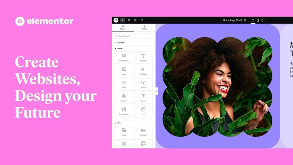
Elementor moved from a simple page builder to a real design system when Theme Builder arrived. Users could design headers, footers, single posts, and archive templates right on the canvas. No more poking around PHP files or chasing down template parts. Everything lived in the interface.
Global Styles pushed consistency across large sites. Design tokens and reusable parts kept type, colors, and spacing locked in. Set rules once, watch them apply everywhere. It worked like a built-in style guide, saved hours of cleanup, and kept brands consistent.
Responsive controls fixed a long‑standing pain. Editors adjusted layouts for desktop, tablet, and mobile without touching CSS. Nudge margins, change font sizes, preview instantly. The editor view matched the live site across devices.
Developers got an API that opened the door for third‑party widgets and add‑ons. A marketplace formed around it, filling niche needs fast – special sliders, custom form integrations, and more. Elementor turned into a platform with a steady flow of new options.
Performance stayed a priority. Elementor generated CSS only for elements used on a page and loaded assets conditionally. Less bloat, healthier Core Web Vitals, and faster pages without giving up flexibility.
WooCommerce users gained visual control over product templates and archives, all in the same drag‑and‑drop workspace. Store owners shaped shopping flows without switching themes or writing custom code.
Education tied it together with tutorials and repeatable patterns for landing pages and sales funnels. The guides taught real use cases, sped up first wins, and helped new users stay engaged.
Decisions that scaled Elementor and aligned it with the ecosystem
Elementor arrived before Gutenberg settled in, meeting a clear need for visual layout control that WordPress users wanted. That timing let it shape how people built sites without waiting for core changes. A split between Yoni’s product and design focus and Ariel’s engineering focus kept decisions crisp. Speed stayed high while user experience and performance stayed in balance.
A freemium launch on WordPress.org wasn’t only about price. Reviews, rankings, and discoverability drove organic reach that paid ads wouldn’t match early on. Tight alignment with popular themes and WooCommerce eased adoption inside existing stacks, which cut setup pain for site builders who needed flexibility with low friction. Open APIs drew in third‑party add‑ons, so the product grew through an ecosystem instead of bloating the core.
Community feedback acted as constant user research at no extra cost and set priorities in real time. For founders, a few grounded takeaways stand out. Solve daily pains that waste time or money first. Start free or with a low barrier to show value fast. Design for extensibility from day one so the product grows naturally. Keep performance front and center because speed wins users and rankings.
Step back and press on hard questions about the product. How locked in are users? Do they hit value fast enough to stay? Does it fit smoothly into current tools and workflows? Honest answers here point toward stronger growth paths, not dead ends.
Leave a Reply